Advanced Data Visualization
Data Visualization & Computing in the Humanities
While we haven’t necessarily focused on data visualization per se, a lot of our readings, example projects, and discussions have touched on data visualization in various ways (whether discussions about interfaces or how to make arguments with data or doing exploratory data analysis).
Examples of data visualization in the humanities include:
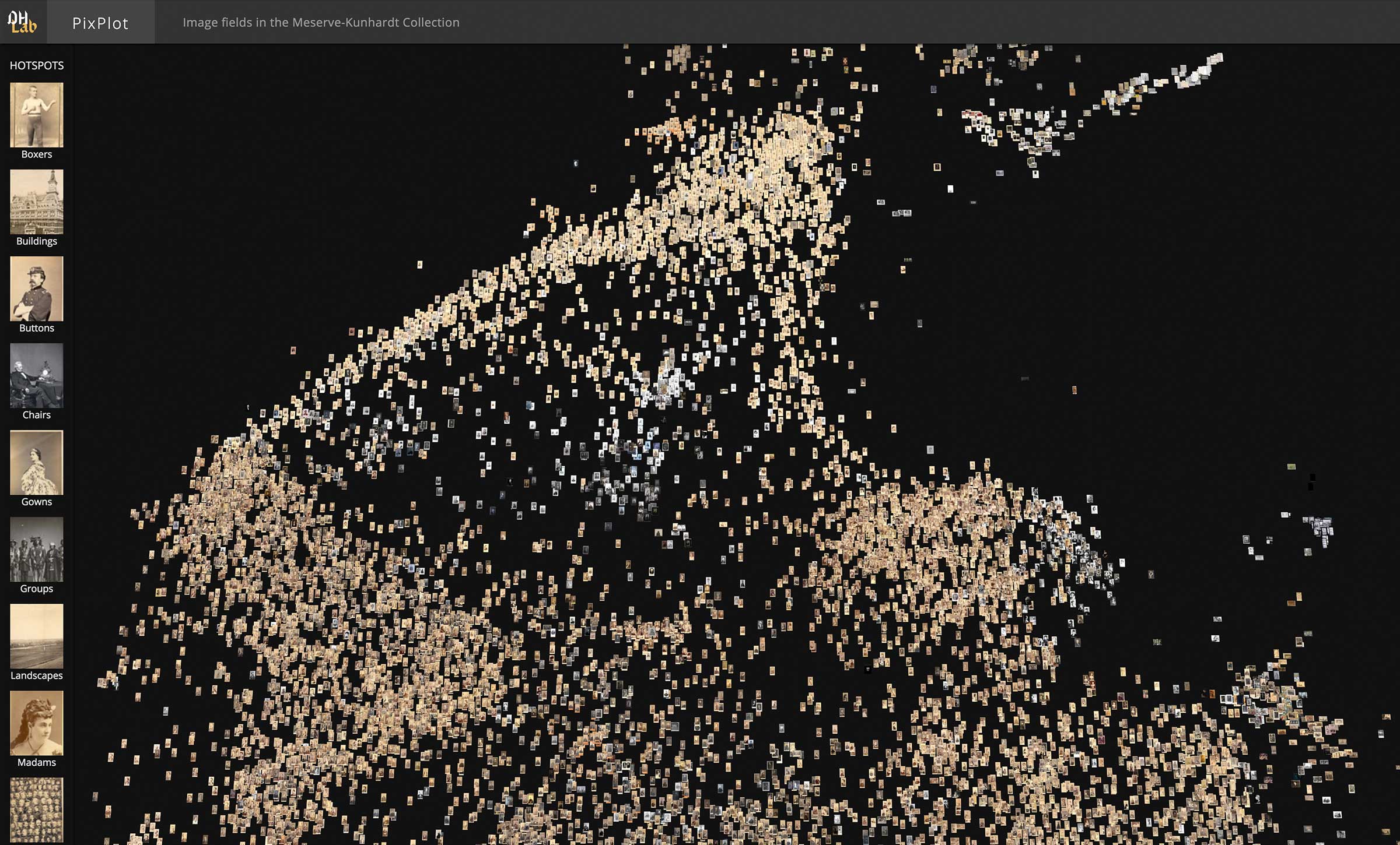
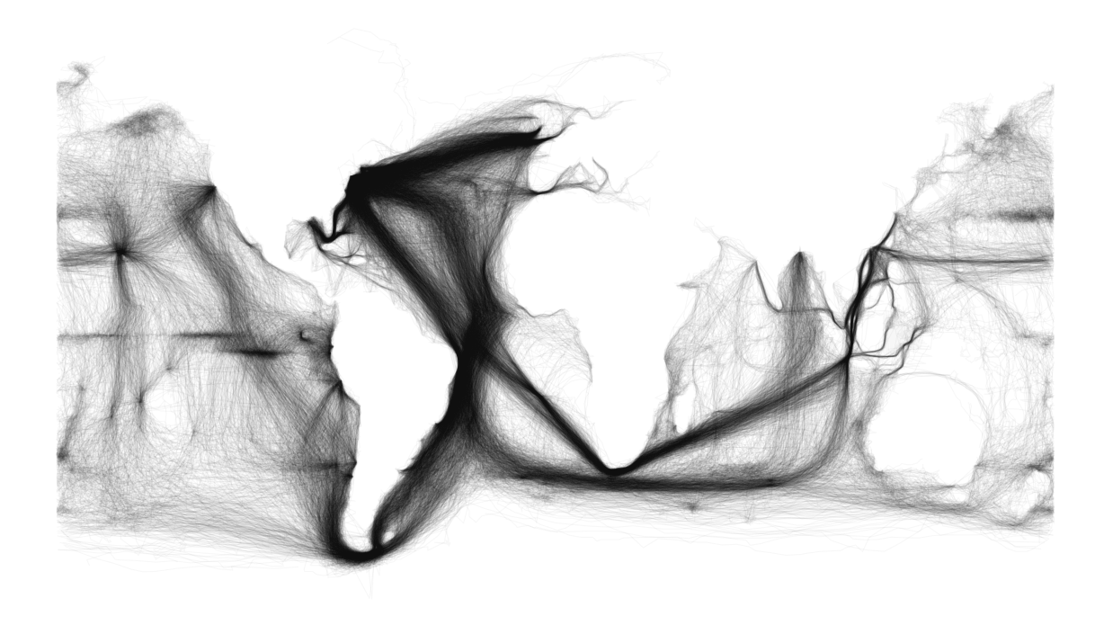

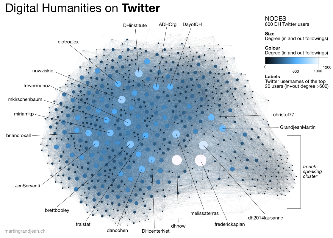
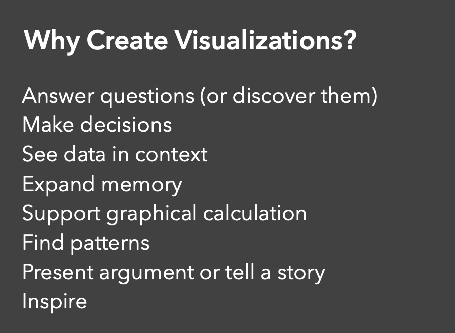
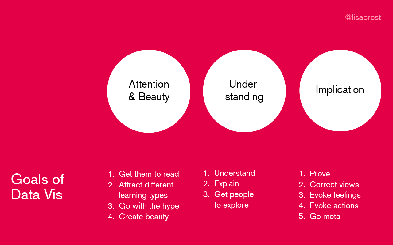
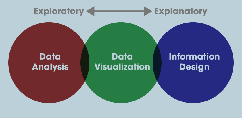
All of these projects use data visualization in different ways, which brings us to the larger questions of why create visualization in the first place? There’s no definitive answer but I think these infographics provide some helpful overview/answers:
- From Jeffrey Heer:
- From Lisa Charlotte Muth:
- From Duncan Geere:
We’ll discuss some of these in class, but
Data Visualization in Python and Pandas
Up to now we’ve been using Pandas built in plot methods to display our data. While this is helpful for quick analyses, you’ll likely want more options for both how you visualize the data and interact with it.
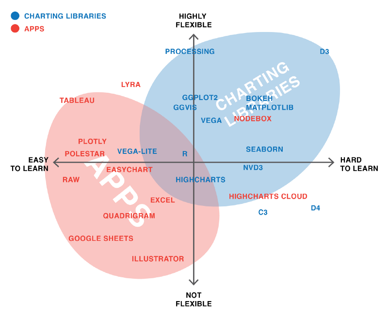
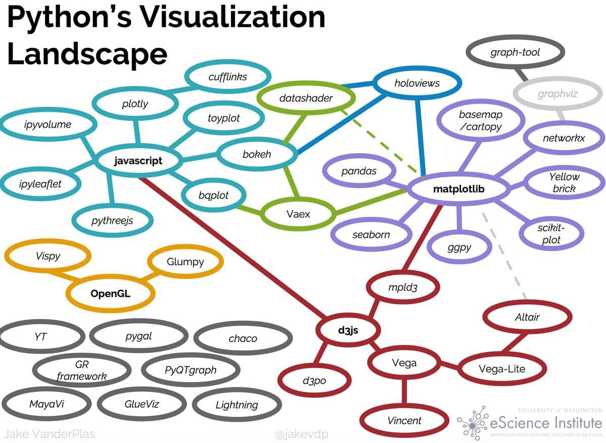
In Python, there are a number of visualization libraries, including Matplotlib, Seaborn, and Plotly that have extensive communities and documentation. Today we’re going to focus on Altair, which is a Python library built on top of Vega and Vega-Lite - two visualization libraries for JavaScript.
Introduction to Altair
Let’s install Altair
Remember to activate your virtual environment if you are using one!
pip3 install altair vega vega_datasets
Now let’s try it out in our Jupyter Notebook
import altair as alt
Because we are using Altair in a Jupyter Notebook we also need to add a few settings (you read more about this here https://altair-viz.github.io/user_guide/display_frontends.html#displaying-in-the-jupyter-notebook)
alt.renderers.enable('notebook')
alt.data_transformers.enable('default', max_rows=None)
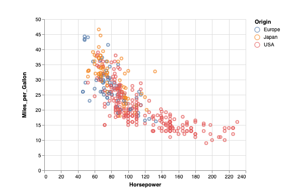
Now we can try out Altair with one of the built-in datasets
cars = alt.load_dataset('cars')
alt.Chart(cars).mark_point().encode(
    x='Horsepower',
    y='Miles_per_Gallon',
    color='Origin',
)
You should now see the following graph:
If you don’t see the graph, you might need to set the kernel of your notebook https://stackoverflow.com/questions/47295871/is-there-a-way-to-use-pipenv-with-jupyter-notebook or set the vega extension with following:
jupyter nbextension install --sys-prefix --py vega
So let’s breakdown what we’re doing here
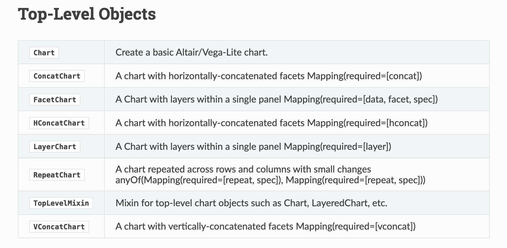
First we are specifying a new Chart class. In Altair, there are a number of Chart types that we’ll delve into later but it essentially is the basic class we’ll be working with (more information here https://altair-viz.github.io/user_guide/API.html#top-level-objects).
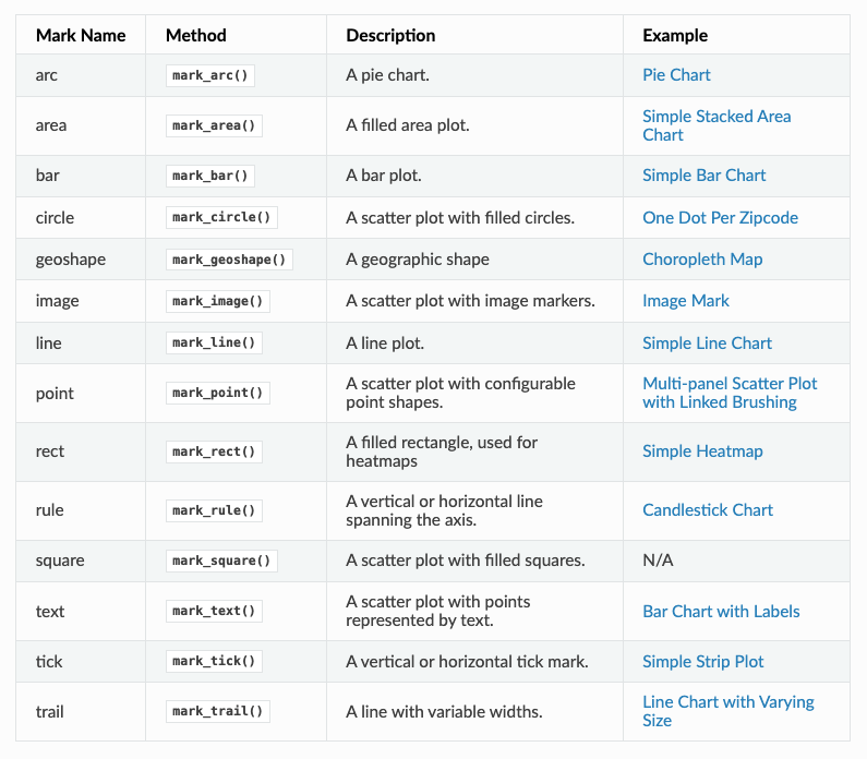
We pass our data to the Chart and then specify the type of mark we are using (in our case we are using mark_point() to make points). In Altair, we can use all types of marks to represent our data https://altair-viz.github.io/user_guide/marks.html.
Finally we are calling encoding to specify what variable we want to represent on the x and y axis, as well as through the color encoding. Altair has many fields for encoding https://altair-viz.github.io/user_guide/encoding.html
So let’s try recreating our graph charting the frequency of Humanities Computing versus Digital Humanities in our scraped dataset
humanist_vols['humanities_computing_counts'] = humanist_vols.text.apply(lambda x: x.count('humanities computing'))
humanist_vols['digital_humanities_counts'] = humanist_vols.text.apply(lambda x: x.count('digital humanities'))
counts = humanist_vols[['digital_humanities_counts', 'humanities_computing_counts']]
counts.plot()
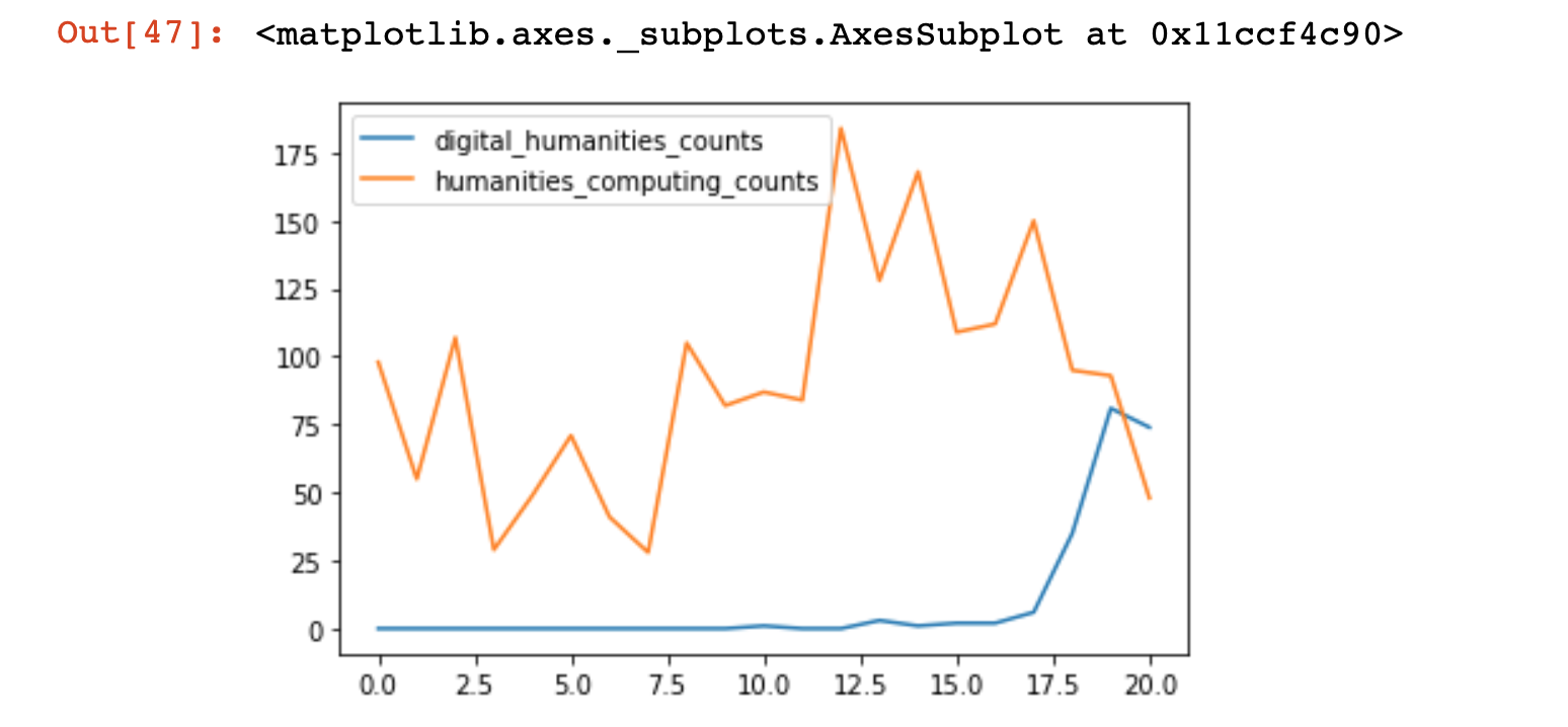
What are some of the problems with this graph?
Let’s try rebuilding it in Altair, what we want to represent on our x and y axis?
Almost immediately you’ll realize that we need to reshape our data to be able to show both counts.
In data analysis, you will often need to transform your dataset from wide to long and long to wide (that is adding more rows vs more columns). Pandas has a number of ways to do that, and you can read more about it here https://pandas.pydata.org/docs/user_guide/reshaping.html#reshaping-by-melt.
Today we’re going to try melting our dataset to turn our digital_humanities_counts and humanities_computing_counts into rows.
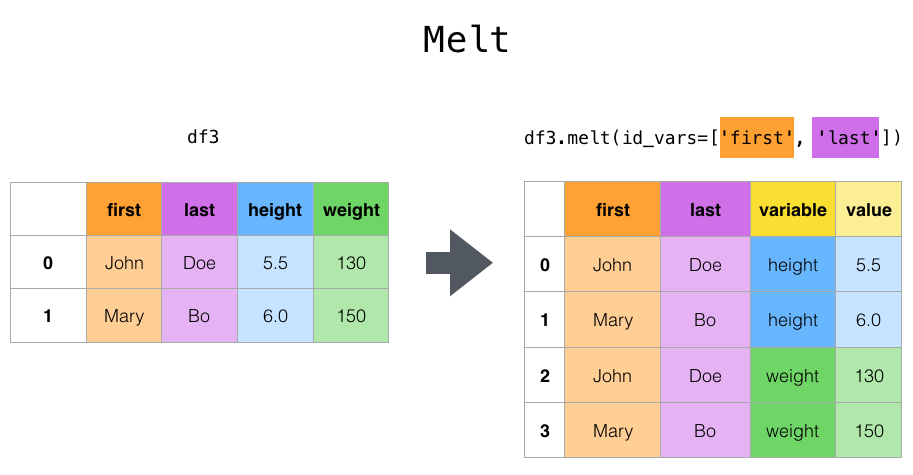
So looking at the syntax, first we need to decide what our id_vars will be. Which raises the question of what else might we want to display in the graph? (hint think about time!)
counts_melted = pd.melt(counts, id_vars=['dates'])
Now in counts_melted we should have columns for dates, variable, and value, which contains our transformed columns.
So let’s try making our chart:
alt.Chart(counts_melted).mark_line().encode(
    x='dates',
    y='value',
)
This produces the following graph:
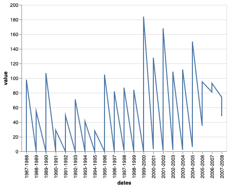
What do we need to add to our graph? hint look below!
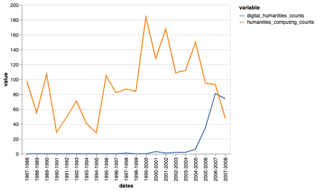
Let’s try specifying the data types for Altair https://altair-viz.github.io/user_guide/encoding.html#encoding-data-types, which one would we use for each of our fields?
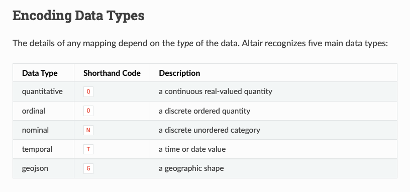
You’ll notice that these encoding options look very similar to our chart on different data types from the Intro to EDA Lesson.
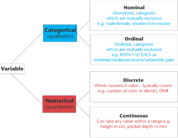
What happens if we try using the temporal encoding on dates?
One of the trickiest areas for data analysis is working with dates and times (think timezones and formatting!).
Pandas has built-in functionality to handle dates so we’re going to try and add a column to our dataframe that holds the year. Take a look at the docs https://pandas.pydata.org/pandas-docs/stable/reference/api/pandas.to_datetime.html
How could we get the year for each of our rows?
counts['year'] = counts.dates.str.split('-').str[0]
counts['year'] = pd.to_datetime(counts.year, format='%Y', errors='ignore')
Now let’s try rerunning our graph but using year.
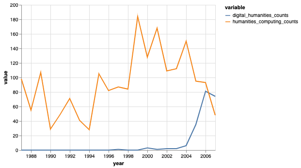
We officially have recreated this graph and added more information that would be useful to a reader 🥳.
Advanced Altair
Interactivity
With Altair, we can also add interactivity! Let’s try adding a tooltip that displays both values at once when hovered.
Check out this example https://altair-viz.github.io/gallery/scatter_tooltips.html We can also do more complex interactions, like those outlined here https://altair-viz.github.io/user_guide/interactions.html. Let’s try and have some click actions as well by following this example https://altair-viz.github.io/gallery/interactive_legend.html.
Multiple Charts
We can also combine charts together with Altair!
Initially we had explored the size of the volumes over time. It would likely be helpful to contextualize our word counts with the size of the volume (otherwise our trends might be driven by changing amount of vocabulary). We could normalize our counts by the volume size and/or we could provide a graph showing the change in the listserv volume size over time.
How would you count the listservs by volume size? You could count new lines like we did previously or number of characters or number of tokens (aka words).
humanist_vols['volume_size'] = humanist_vols['text'].str.count('\n')
Now let’s create a chart for the volume size over time. What goes into our x and y axis?
alt.Chart(humanist_vols).mark_line().encode(
    x='??',
    y='??',
)
Once we have that sorted, the final step is to save our charts into variables (maybe word_counts_chart and volume_size_chart). Then we can combine them!
alt.hconcat([word_counts_chart, volume_size_chart])
So here we used Altair’s horizontal concatenation to place our charts next to each other (you can read more about how to concat here https://altair-viz.github.io/user_guide/compound_charts.html#hconcat-chart). This looks great but what would happen if we added a color encoding to our volume_size_chart? We might end up with some very strange legends.
One trick if you are trying to combine charts with different scales is to the resolve_scale() method, which will tell Altair that the color encodings are these two graphs are independent (you can read more about resolving scales here https://altair-viz.github.io/user_guide/scale_resolve.html).
Saving Altair Graphs
Now that we have our graphs the final step is to save them! Altair makes this relatively easy with both interactive saving options and the save() method.

If you haven’t noticed yet there’s a small circle with three dots when you hover over the chart. This is the interactive save option. If you click on it you will see the option to save the chart as a PNG or SVG.
While hopefully you have seen these file formats before, we can also see Source and Compiled Vega (which in this case are essentially the same), as well as Open in Vega Editor. Let’s click on that final option and see what happens 👀.

Woah! Where did we go??? To Javascript land!
I’ve hopefully mentioned this already, but in case I haven’t, Altair is actually a wrapper around a Javascript library, Vega-Lite, which itself is a wrapper around another library called Vega. If you’ve heard of D3.js, then Vega is an alternative library for making a visualization grammar. If you’re curious about Vega, you can look at their simple bar chart tutorial to compare to the bar chart we created https://vega.github.io/vega/tutorials/bar-chart/.
The biggest benefit of Altair being a wrapper is that you can download the compiled vega and drop it into any html file to publish your graph to the web (more info on that is available here https://vega.github.io/vega-lite/tutorials/getting_started.html#embed). This is super exciting because Javascript visualization libraries like D3 have a very steep learning curve, and other visualization libraries like ggplot2 only work in R.
In the interactive save, you have the option to download the compiled json from your chart by clicking the Open in Vega Editor. This will open a new window with the full Vega schema. You can select the export option, which will allow you to download the JSON (you can select either compiled or vega-lite).
You can also directly save your charts using the save() method. For general guidelines on saving Altair charts, check out the documentation here https://altair-viz.github.io/user_guide/saving_charts.html. I have had mixed results using the save method because it requires some complex dependencies to be installed. You can also use the downloaded json option to embed these charts in your webpage, which I have instructions on how to do here https://zoeleblanc.com/blog/publish-altair/.
