EDA & Data Visualization
Data Explorations
In our advanced assignment from our notebooks lesson, we were asked to explore the Pudding Film Dialogue datasets. We were asked to answer the following questions:
- How could we tell if the amount of dialogue was increasing over time in movies? How might this influence the assessment about the breakdown of gender dialogue?
- How could test if there was any relationship between the film’s gross value and the amount of dialogue in the film?
To do this, we need to first download these datasets from GitHub https://github.com/matthewfdaniels/scripts/ and then load them into our notebook. We can use the pandas library to do this (remember to include an exact path to where your files are stored!).
Let’s create a new folder in our is310-coding-assignments called eda-data-viz and then create a new Jupyter notebook in this folder called EDAFilms.ipynb. Then we can start by loading in the data.
import pandas as pd

film_scripts = pd.read_csv('cleaned_pudding_data.csv')
character_list_df = pd.read_csv('character_list5.csv')
character_mapping_df = pd.read_csv('character_mapping.csv')
metaddata_df = pd.read_csv('meta_data7.csv')
When loading in the data, you might get UnicodeDecodeError: 'utf-8' codec can't decode byte 0xe9 in position 12243: invalid continuation byte. This is because the file is not encoded in utf-8. You can try using ISO-8859-1 instead.
character_list_df = pd.read_csv('character_list5.csv', encoding='ISO-8859-1')
character_mapping_df = pd.read_csv('character_mapping.csv', encoding='ISO-8859-1')
metaddata_df = pd.read_csv('meta_data7.csv', encoding='ISO-8859-1')
Encoding errors are common when working with data, especially data that was produced by others. The reason for this is that different operating systems and software use different character encodings to represent text. When we save a file, it is encoded in a specific way, and when we open it, we need to know how it was encoded in order to read it correctly.
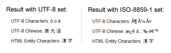
ISO-8859-1 and utf-8 are both character encodings used to represent text in computers. ISO-8859-1, also known as Latin-1, is a single-byte encoding that can represent the first 256 Unicode characters but only covers Western European languages.
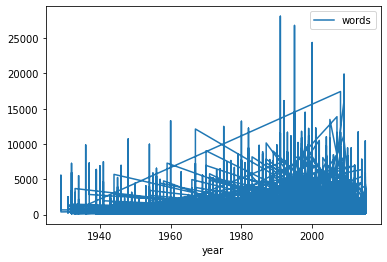
On the other hand, utf-8 is far more popular because it is a variable-width character encoding that can encode all possible Unicode characters. It uses one byte for the first 128 Unicode characters (similar to ASCII), but can use up to four bytes for other characters, making it capable of representing all languages and many special symbols. We can see the growing popularity of utf-8 in the graph below.

Now that we have the data correctly loaded and encoded, we can start to explore it. We can use the head() method to display the first few rows of the DataFrame.
character_list_df.head()
This should give us a table that looks like this:
| script_id | imdb_character_name | words | gender | age | |
|---|---|---|---|---|---|
| 0 | 280 | betty | 311 | f | 35 |
| 1 | 280 | carolyn johnson | 873 | f | nan |
| 2 | 280 | eleanor | 138 | f | nan |
| 3 | 280 | francesca johns | 2251 | f | 46 |
| 4 | 280 | madge | 190 | f | 46 |
character_mapping_df.head()
This should give us a table that looks like this:
| script_id | imdb_id | character_from_script | closest_character_name_from_imdb_match | closest_imdb_character_id | |
|---|---|---|---|---|---|
| 0 | 1 | tt0147800 | bianca | bianca stratford | nm0646351 |
| 1 | 1 | tt0147800 | cameron | cameron james | nm0330687 |
| 2 | 1 | tt0147800 | chastity | chastity | nm0005517 |
| 3 | 1 | tt0147800 | joey | joey donner | nm0005080 |
| 4 | 1 | tt0147800 | kat | kat stratford | nm0005466 |
metaddata_df.head()
This should give us a table that looks like this:
| script_id | imdb_id | title | year | gross | lines_data | |
|---|---|---|---|---|---|---|
| 0 | 1534 | tt1022603 | (500) Days of Summer | 2009 | 37 | 743544525677477444334257777565774443444456445674543367553452777734237544553444343334444444467441433777777777777776634344344434244343433435535624644435776576434333377775756764434344466346764533566544444777533356445543543343334444535476332345777777777777776 |
| 1 | 1512 | tt0147800 | 10 Things I Hate About You | 1999 | 65 | 177775232027453334445777772243377733444376467744677740424516733144464355045563543423354653735714457434333434243540000354213722445102431377774150047353236346777770432577633435475477734777720434517632245454363064653552333354735636524467333433433433530001363 |
| 2 | 1514 | tt0417385 | 12 and Holding | 2005 | nan | 54613577777542124545444413677744334465476477533416774357535660534376444724437777421544734354157437777135461357777754212454544441367774433446547647753341677435753566053437644472443777742154473435415743777713 |
| 3 | 1517 | tt2024544 | 12 Years a Slave | 2013 | 60 | 4567334777777777777777447777756477777444777777777777443453437553133677762333344777777777777764355777777777651 |
| 4 | 1520 | tt1542344 | 127 Hours | 2010 | 20 | 453513352345765766777777773340 |
So, now we can start to consider how the variables in these datasets might be useful to answer our questions. For example, we could use the words column in the character_list_df to measure the amount of dialogue in a film. We could use the year column in the metaddata_df to measure the amount of dialogue over time. We could use the gross column in the metaddata_df to measure the relationship between the film’s gross value and the amount of dialogue in the film. Finally, we could use the gender column in the character_list_df to measure the breakdown.
Notice that we don’t seem to need character_mapping_df for these questions, but we might need it for other questions. For example, if we wanted to explore the relationship between length or frequency of character names and the amount of dialogue, we would need to merge this dataset with the character_list_df dataset.
To do this though we would need to merge these datasets together. So let’s try it out!
Merging Data With Pandas
We’ve mentioned merging datasets a bit when we discussed joining data in class and SQL, but now we want to dig into details. Often times when we’re working with datasets, we will have our data split into multiple csv files. Pandas has built in functionality that let’s us merge together DataFrames so that we can perform analysis on the combined dataset, which you can read about in the very extensive documentation here https://pandas.pydata.org/docs/user_guide/merging.html.
While this documentation shows a number of ways to combined datasets (concat let’s you combine datasets by stacking them on top of each other, join let’s you combine datasets by joining them on a common index, and merge let’s you combine datasets by joining them on a common column), we will focus on the merge method.

If we take a look at the documentation, we see the syntax above, which shows us that in Pandas we use the merge() function to combine datasets. The merge() function takes in a number of parameters, but the most important ones are left, right, how, and on. The left and right parameters are the DataFrames we want to merge, the how parameter is the type of join we want to undertake, and the on parameter is the column we want to join the DataFrames on.
We can also see an example of how this works in the figure below.

You’ll notice that we can see a description of the types of how parameters we can use. These are the same types of joins that we discussed in class and in SQL. The how parameter can be set to left, right, outer, or inner. The left join will return all the rows from the left DataFrame and the matching rows from the right DataFrame. The right join will return all the rows from the right DataFrame and the matching rows from the left DataFrame. The outer join will return all the rows from the left DataFrame and the right DataFrame. The inner join will return only the rows that match in both DataFrames.

Now that we are starting to understand this logic, we can consider how we might merge our datasets to answer our questions. For our first question, we want to explore the shift in dialogue over time, which requires combining data from the character_list_df and metaddata_df DataFrames.
To do this we need to think about the different shapes of our DataFrames and also what columns they have in common.
We can check their columns with the .columns method.
print(character_list_df.columns), print(metaddata_df.columns)
From this we should see that both DataFrames have a script_id column. This is the column we want to join the DataFrames on. We can also check the shape of the DataFrames with the .shape method.
print(character_list_df.shape), print(metaddata_df.shape)
From this we can see that the character_list_df DataFrame has 23048 rows and 5 columns, and the metaddata_df DataFrame has 2000 rows and 6 columns. This means that the character_list_df DataFrame has more rows than the metaddata_df DataFrame. This is important to note because when we merge DataFrames with differing number of rows, we will end up repeating some values which is completely ok but something to think about.
So now to merge the DataFrames we can use the merge() method.
dialogue_df = pd.merge(character_list_df, metaddata_df, on='script_id', how="inner")
You’ll notice in this syntax that we are using the script_id column to join the DataFrames, and we are using the inner join. This means that we will only return the rows that match in both DataFrames. In this particular example, we could use the left join as well, but we would end up with the same DataFrame because the script_id column is the same in both DataFrames. You can also experiment with the different how parameters and see what changes for the DataFrame.
Now we can start to try answering our questions. For example, we could use the groupby() method to group the data by the year column and then use the sum() method to sum the words column.
dialogue_df.groupby('year')['words'].sum()
This will give us a series that looks like this:
year
1929      8572
1931     11601
1932     67534
1933     21125
But this is a bit hard to inspect since there’s so many rows, which is why we are starting to need to do some EDA with data visualization.
In Class Exercise
Before visualizing and exploring more of our data, try merging the remaining DataFrames that we will need to answer our questions.
- Rather than using
grossfrom metadata_df, we might want to use thegross_iacolumn from thefilm_scriptsDataFrame. Merge this DataFrame with thedialogue_dfDataFrame. - We might also want to use the
character_mapping_dfto explore the relationship between length or frequency of character names and the amount of dialogue. Incharacter_mapping_df, try finding the top 10 most frequent names, and then merge this DataFrame with thedialogue_dfDataFrame.
For more resources on merging DataFrames, check out https://www.educative.io/edpresso/three-ways-to-combine-dataframes-in-pandas and for more on Pandas see Melanie Walsh’s lesson https://melaniewalsh.github.io/Intro-Cultural-Analytics/03-Data-Analysis/00-Data-Analysis.html and Jake VanderPlas’s Python Data Science Handbook https://jakevdp.github.io/PythonDataScienceHandbook/03.00-introduction-to-pandas.html.
EDA With Pandas
So far, we have been focused on combining our datasets but now that we have started we also want to start inspecting them: this process is often called Exploratory Data Analysis.

You’ve likely heard this term before, but to give a bit of history In his 1977 book Exploratory Data Analysis, John W. Tukey argued that EDA could help suggest hypotheses that could be then tested statistically.

EDA emphasizes understanding the data’s underlying structure and extracting important variables, detecting outliers and anomalies, and testing underlying assumptions through visualizations, statistics, and other methods, without initially focusing on formal modeling or hypothesis testing. This approach differs with traditional hypothesis-driven analyses, promoting a more flexible and intuitive investigation into the data.
With Pandas we can perform all of the necessary steps for EDA.
-
We want to explore the data, so we could use
head(),tail(), orsample()methods to display a subset of the dataset. We could also use.shapeor.dtypesto see shaped of the DataFrame and the data types of each column. -
Next we might use the
describe()method to output a summary of our dataset. According to the documentation for this method, it provides “descriptive statistics include those that summarize the central tendency, dispersion and shape of a dataset’s distribution, excluding NaN values.” (Read the docs here). -
After getting this bird’s eye view of the distribution of the data, we could use
sort_values()ornsmallest()/nlargest()to either organize the dataset or return the rows with maximum or minimum of values in a certain column. -
We can use the
isna()to see what values might be missing in the dataset. Remember thatisna()can be run on either individual columns or the entire DataFrame, and that you can chain it with other methodsany()to check if there are any null values in the data. -
Finally we would use the
plot()method to do some initial graphing of the trends in our data to fully help explore its distribution and potential correlations.
So in our case, we might first use .dtypes on our dialogue_df to see what types of data we have.
dialogue_df.dtypes
Then we might use the describe() method to output a summary of our dataset.
dialogue_df.describe()
We could also use the sort_values() method to organize the dataset by the year column.
dialogue_df.sort_values('year')
We could also use the isna() method to see what values might be missing in the dataset.
dialogue_df.isna().any()
Now that we have a sense of the distribution of our data, we can start to visualize it to see if we can answer our questions.
Like many of the methods above, plot is built into Pandas and is a wrapper around the matplotlib library. This means that we can use the plot() method to create a variety of different plots. You can read more about the plot() method in the Pandas documentation here https://pandas.pydata.org/pandas-docs/stable/reference/api/pandas.DataFrame.plot.html and more generally about visualization with Pandas here https://pandas.pydata.org/pandas-docs/stable/user_guide/visualization.html.
For the plot syntax, we usually need to specify the type of graph we want to create, and then what we want on the x and y axis. For example, if we wanted to create a line graph of the year and words columns, we would use the following syntax.
dialogue_df.plot(kind="line", x="year", y="words")
We should see the following graph:
This is technically working but very hard to read. We can make it more readable by using the groupby() method to group the data by the year column and then use the sum() method to sum the words column.
grouped_dialogue_df = dialogue_df.groupby('year')['words'].sum().reset_index()
grouped_dialogue_df.plot(kind="line", x="year", y="words")
This should give us a graph that looks like this:

Using groupby here makes sense for visualizing our data and seeing the trends over time, but it’s important to understand this is a form of data transformation. We are transforming our data to make it more amenable to analysis, which is a key part of the data cleaning process, as we read in Rawson and Muñoz’s article “Against Cleaning” where they discuss the concept of “data cleaning” as a process of “transforming data to make it more amenable to analysis”.
“Cleaning” Data With Pandas
In our current example, we’ve already started to clean our data by merging the DataFrames together and transforming the data to make it more amenable to analysis. We might also want to subset the data like we did in our last lesson:
film_scripts[film_scripts.gross_ia >= 0]
film_scripts_cleaned = film_scripts[film_scripts.gross_ia.isna() == False]
If we had found nulls, we could have used the dropna() method to drop them and also checked for duplicates and dropped them using the drop_duplicates() method https://pandas.pydata.org/pandas-docs/stable/reference/api/pandas.DataFrame.drop_duplicates.html. As we are starting to understand though, all these steps involve tradeoffs and decisions about what to keep and what to discard.
As we discussed in class, a lot of what motivates this “cleaning”, whether that means normalizing distributions, removing null values, and even transforming some of the data to standardize it, is the concept of GIGO.
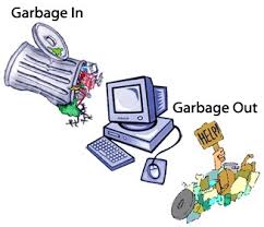
GIGO stands for “Garbage In, Garbage Out” (to read more about the origins of GIGO, read this article https://www.atlasobscura.com/articles/is-this-the-first-time-anyone-printed-garbage-in-garbage-out). GIGO is important because it essentially means that the quality of your data analysis is always dependent on the quality of your data.
However, for as much as we want to prioritize quality, what are some of the downsides or tradeoffs of cleaning data? Some potential considerations include:
- losing the specificity of the original data (especially a danger for historic data but also for data collected by certain institutions)
- privileging computational power over data quality or accuracy
- releasing datasets publicly without documenting these changes
This list is by no means exhaustive! But number one thing to remember with datasets is that the act of collecting data is in of itself an interpretation. And so cleaning data adds another layer of interpretation (sometimes many layers) to the dataset, which is why its crucial to keep a record of how you transform your data.
It is also important to realize that even with cleaning you will never have a perfect dataset and to remember that this is often an iterative process and not a one time thing. You will likely need to re-transform your data many times depending on your methods. We’ve only barely scratched the surface of data cleaning here (for some more examples you can check out https://towardsdatascience.com/the-ultimate-guide-to-data-cleaning-3969843991d4).
One best practice is to save multiple versions of your dataset as csv files, so that you don’t either overwrite your original data or have to rerun previous transformations. Remember that with Pandas we can read and write csv files using pd.read_csv() and {name of your dataframe}.to_csv().
In addition to thinking about our choices, it is also important to think about the types of data we are working with.

This graph outlines the main types of data you might encounter, which largely breaks down between qualitative (categorical) or quantitative (numerical).
For example, say you have gender as a field in your dataset, but who ever initially encoded the data did not do so in a standardize way.
Gender
m
Male
fem.
FemalE
Femle
Before standardizing this data, it’s helpful to consider whether you’re interested in these spelling errors (maybe this is census data for example) or if you want to fix them for your analyses. If you do decide to fix them, they you would be changing the data into categorical and nominal data (rather than categorical and ordinal).
There’s a few ways we could standardize this using Pandas. One is the map() method which takes a dictionary where the keys are the spelling errors and the values are the correct categories.
example_df = pd.DataFrame({'gender': ['m', 'Male', 'fem.', 'FemalE', 'Femle']})
example_df['gender'].map({'m': 'male', 'fem.': 'female', ...})
However, say we have quite a few misspellings, it will get tedious trying to write them all out. Instead, we can use pattern matching and regular expressions. Regular expressions (or regex) are any sequence of characters that we can search for in another string. Most programming languages use them and you can learn more about them here https://regexone.com/.
In Python, there is the library re that comes with the Python Standard Library and is built for regex (you can read the docs here https://docs.python.org/3/library/re.html). However, Pandas also has built in functionality for handling regex.
example_df.gender[example_df['gender'].str.match(r"m", flags=re.IGNORECASE)] = 'male'
example_df.gender[example_df['gender'].str.match(r"f", flags=re.IGNORECASE)] = 'female'
Here we are using the str.match() method and regex to check if the strings in our rows start with these values and are ignoring whether they are upper or lowercase.
Another method is that we could also first lowercase these strings in the gender column and then use the str.contains() method instead.
example_df.gender = example_df.gender.str.lower()
example_df.gender[example_df.gender.str.contains('fem')] = 'female'
example_df.gender[example_df.gender.str.contains('fem') == False] = 'male'
In this example, if we had done str.contains('male') we would have ended up over writing our female values, so we always need to be careful with these transformations.
As a reminder, Pandas has a number of built in methods for working with strings that can help us check for all sorts of values (like decimals, numbers, or spaces) and transform string values. You can read more about working with text data and pandas here https://pandas.pydata.org/pandas-docs/stable/user_guide/text.html#method-summary.
In Class Exercise
In the case of our data, we have created one field that might be need of some cleaning, and that’s the frequency of character names category. In dialogue_df, let’s make sure that our top 5 character names are categories and that names that don’t appear in the top 5 are categorized as “other”.
Remember that you can use the value_counts() method to get the frequency of the character names and the map() method to categorize the names.
Data Visualization in the Humanities
Now that we have stared to clean and normalize our data, we can continue to visualize patterns. But first, it’s important to understand that data visualization in the Humanities is not just for exploration and analysis, but also for communication. As we discussed in class, data visualization is a form of rhetoric and a way to communicate complex ideas to a wider audience. Here are a few examples that show us some of this breadth:
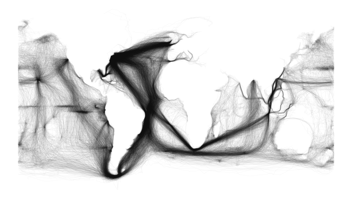

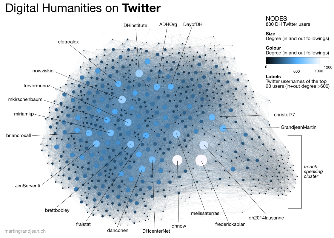
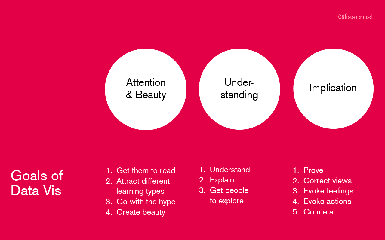
All of these projects use data visualization in different ways, which brings us to the larger questions of why create visualization in the first place? There’s no definitive answer but I think these infographics provide some helpful overview/answers:
- From Lisa Charlotte Muth:
- From Duncan Geere:
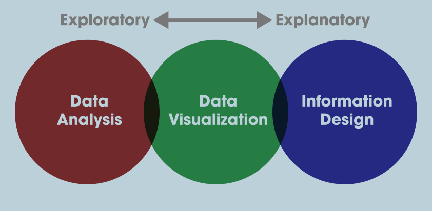
Data Visualization With Altair
With these principles in mind, we can start thinking more expansively about how we want to visualize our data. Up to now we’ve been using Pandas built in plot methods to display our data. While this is helpful for quick analyses, you’ll likely want more options for both how you visualize the data and interact with it.
In Python, there are a number of visualization libraries, including Matplotlib, Seaborn, and Plotly that have extensive communities and documentation. Today we’re going to focus on Vega-Altair, which is a Python library built on top of Vega and Vega-Lite - two visualization libraries for JavaScript. Previously, this library was known as just Altair so for brevity in this lesson we will refer to it as such.
Let’s install Altair
Remember to activate your virtual environment if you are using one!
pip3 install altair vega vega_datasets
Now let’s try it out in our Jupyter Notebook
import altair as alt
Because we are using Altair in a Jupyter Notebook we also need to add a few settings (you read more about this here https://altair-viz.github.io/user_guide/display_frontends.html#displaying-in-jupyter-notebook)
alt.renderers.enable('notebook')
alt.data_transformers.enable('default', max_rows=None)
Now we can try out Altair with one of the built-in datasets
cars = alt.load_dataset('cars')
alt.Chart(cars).mark_point().encode(
    x='Horsepower',
    y='Miles_per_Gallon',
    color='Origin',
)
You should now see the following graph:

If you don’t see the graph and you’re running your Jupyter notebook in the browser, you might need to set the kernel of your notebook https://stackoverflow.com/questions/47295871/is-there-a-way-to-use-pipenv-with-jupyter-notebook or set the vega extension with following:
jupyter nbextension install --sys-prefix --py vega
Alternatively, if you are running it in VS Code, you might need to install the Jupyter extension or change the renderer to alt.renderers.enable('mimetype') https://altair-viz.github.io/user_guide/display_frontends.html#displaying-in-vscode.
So let’s breakdown what we’re doing here
First we are specifying a new Chart class. In Altair, there are a number of Chart types that we’ll delve into later but it essentially is the basic class we’ll be working with (more information here https://altair-viz.github.io/user_guide/api.html#top-level-objects).

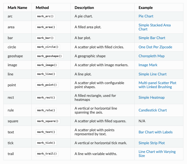
We pass our data to the Chart and then specify the type of mark we are using (in our case we are using mark_point() to make points). In Altair, we can use all types of marks to represent our data https://altair-viz.github.io/user_guide/marks.html.
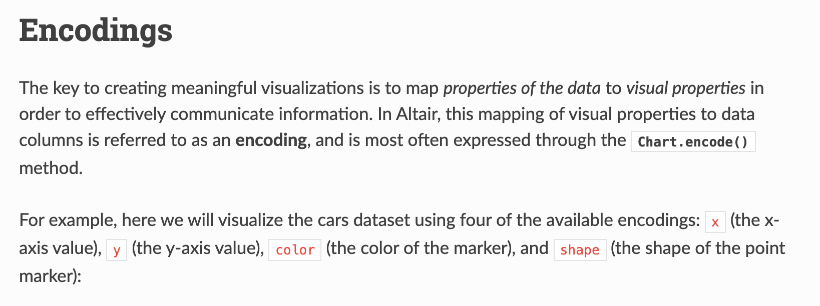
Finally we are calling encoding to specify what variable we want to represent on the x and y axis, as well as through the color encoding. Altair has many fields for encoding https://altair-viz.github.io/user_guide/encoding.html

So let’s try recreating our graph charting the frequency of dialogue over time in Altair
alt.Chart(grouped_dialogue_df).mark_line().encode(
    x='year',
    y='words',
)
You should see the following graph:

What are some of the problems with this graph? Notice that unlike Pandas plot, Altair is not rendering our year as a time series. This is because Altair is not recognizing our year column as a temporal field. We can fix this by specifying the data types for Altair https://altair-viz.github.io/user_guide/encoding.html#encoding-data-types.
alt.Chart(grouped_dialogue_df).mark_line().encode(
    x='year:T',
    y='words',
)
This should give us the following graph:

But now we have an even weirder looking graph. That’s because even though we told Altair that year is temporal, our data type doesn’t reflect that. We can fix this by using the pd.to_datetime() method to convert our year column to a datetime object.
grouped_dialogue_df['date'] = grouped_dialogue_df['year'].astype(str) + '-01-01'
grouped_dialogue_df['date'] = pd.to_datetime(grouped_dialogue_df['date'])
Here I am telling Pandas to convert the year column to a string and then adding -01-01 to the end of it to make it a datetime object. Then I am using the pd.to_datetime() method to convert it to a datetime object and saving it to a new column called date. The choice to save it to a new column is because we might want to keep the original year column for other analyses.
Now let’s try rerunning our graph but using date.
alt.Chart(grouped_dialogue_df).mark_line().encode(
    x='date:T',
    y='words',
)
This should give us the following graph:

Now we have officially recreated what we did with plot() but this takes far more work, so why should we bother? The biggest reason is that Altair is more flexible and powerful than Pandas plot() and can create more complex visualizations. For example, we can add a color encoding to our graph to see how dialogue is split between genders.
grouped_dialogue_df = dialogue_df.groupby(['year', 'gender'])['words'].sum().reset_index()
grouped_dialogue_df['date'] = grouped_dialogue_df['year'].astype(str) + '-01-01'
grouped_dialogue_df['date'] = pd.to_datetime(grouped_dialogue_df['date'])
alt.Chart(grouped_dialogue_df).mark_line().encode(
    x='date:T',
    y='words',
    color='gender'
)
This should give us the following graph:

This is a much more complex graph than we could have created with Pandas plot() and it’s also more flexible. We can also add a tooltip encoding to our graph to see the exact values of the data.
alt.Chart(grouped_dialogue_df).mark_line().encode(
    x='date:T',
    y='words
    color='gender',
    tooltip=['date', 'words']
)
We can also add a title to our graph to make it more readable.
alt.Chart(grouped_dialogue_df).mark_line().encode(
    x='date:T',
    y='words
    color='gender',
    tooltip=['date', 'words']
).properties(
    title='Dialogue Over Time Colored By Gender'
)
As we are starting to see Altair is a very powerful library. We will continue to explore its functionality in the coming weeks, but would highly encourage you to take a look at the example visualizations on the Altair website https://altair-viz.github.io/gallery/index.html and the documentation https://altair-viz.github.io/index.html.
Visualizing the Data Homework
Now that we’ve learned how to visualize and explore data, your homework is to use the film_scripts datasets to answer the following questions using Pandas and Altair. In your Jupyter notebook, you should detail any cleaning or transformations you did to the data and then visualize the data to answer the questions. Your graphs should be interactive and have titles, as well as having the data be correctly formatted.
For the following homework assignments, create a new folder in your is310-coding-assignments repository, called visualizing-data. Once you have completed the assignments, you should push up your solutions to your repository and link to it in the GitHub discussion for this assignment https://github.com/ZoeLeBlanc/is310-computing-humanities-2024/discussions/7.
First, finish trying to answer our original questions using what we have covered today with Pandas and Altair:
- How could we tell if the amount of dialogue was increasing over time in movies? How might this influence the assessment about the breakdown of gender dialogue?
- How could test if there was any relationship between the film’s gross value and the amount of dialogue in the film?
Second, try to answer the following questions:
- How does character frequency relate to the amount of dialogue in a film? Do we see similar character archetypes across genders or do certain gendered characters get more screen time?
- How does age of character relate to the amount of dialogue or the gross revenue of a film? Do we see any trends over time?
These are intentionally open ended questions and you should feel free to explore the data in any way you see fit. Remember that the goal is to communicate your findings to a wider audience, so make sure to include a narrative with your visualizations.