Introduction to Mapping
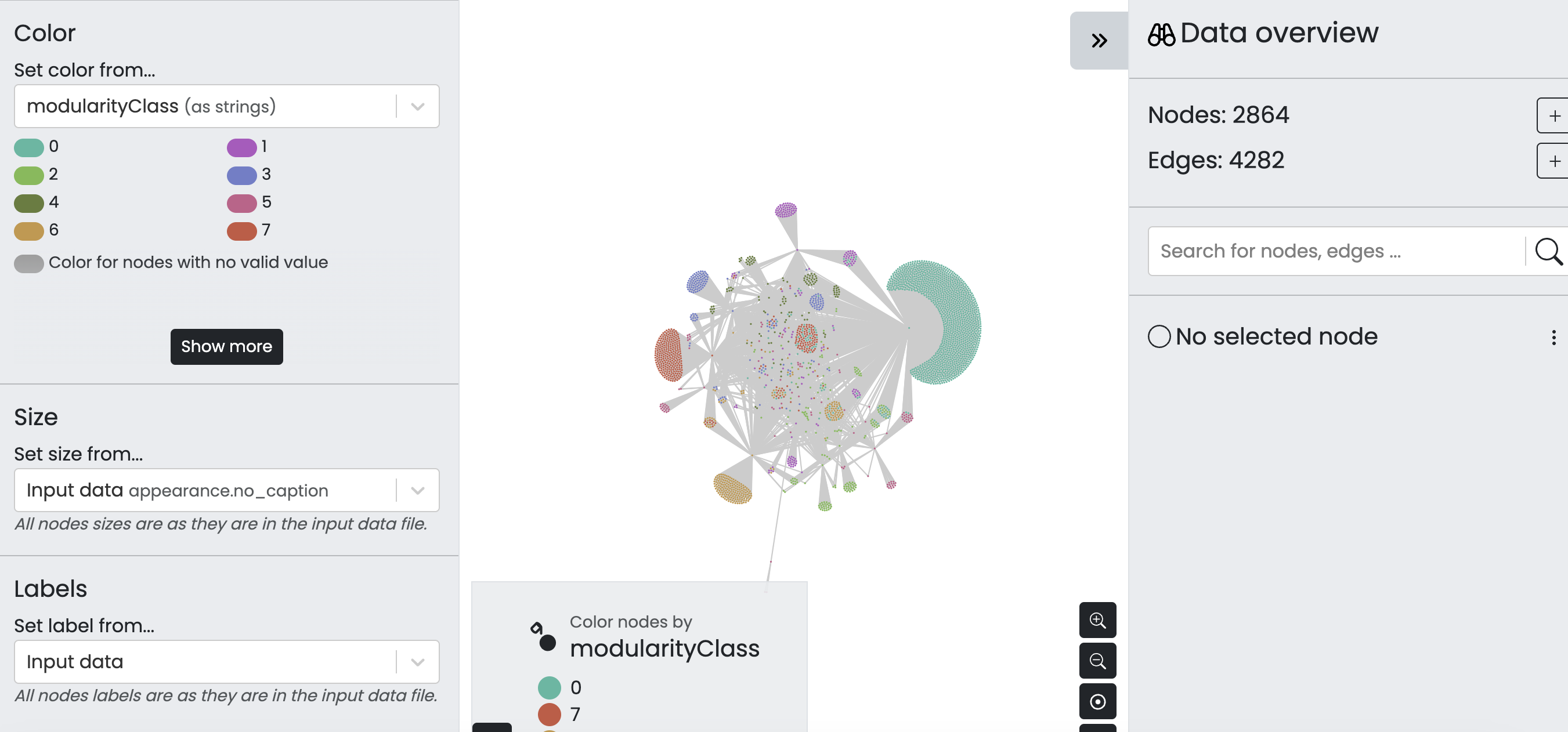
Network Analysis Solutions
So from our assignment last week, there were a number of different datasets and tools to work with. I’m going to focus on showing how we might create networked data from our DH conference + tools data, but happy to answer any questions about the other datasets.
Networking DH Conference + Tools Data
There are a number of potential networks we might create from our original Index of DH Conferences Data or from our combined tool counts and conference data.
One option is to simply take our updated_all_tool_counts.csv, which has the following columns:
tool_name,tool_counts,data_origin,year
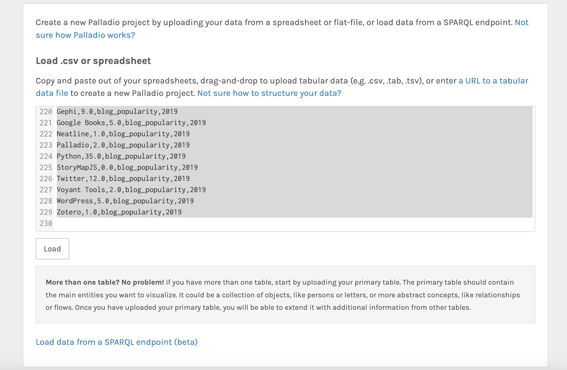
Using the tool Palladio we can upload and see if we can generate some initial results:
Once we’ve uploaded our data, we see the following interface:
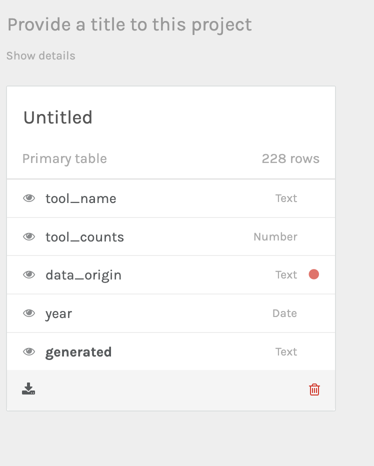
Notice the red dot. That’s telling us that Palladio has some concerns about our data, we can click on it and verify for Palladio that the data is correct:

Now we can start generating our network graph. I’m deciding to explore tool_name to data_origin:
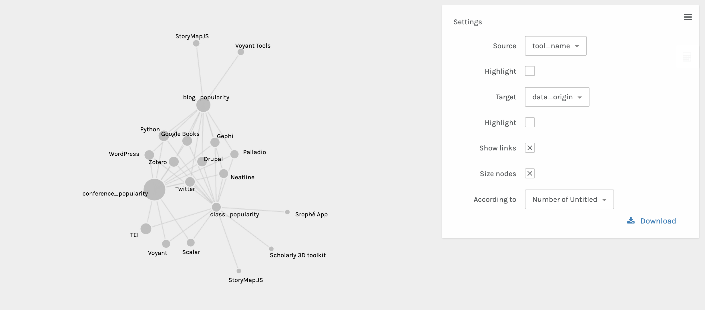
Now we can see that certain tools connect our three datasets, but others are outliers. We can also explore this over time with the timeline facet:
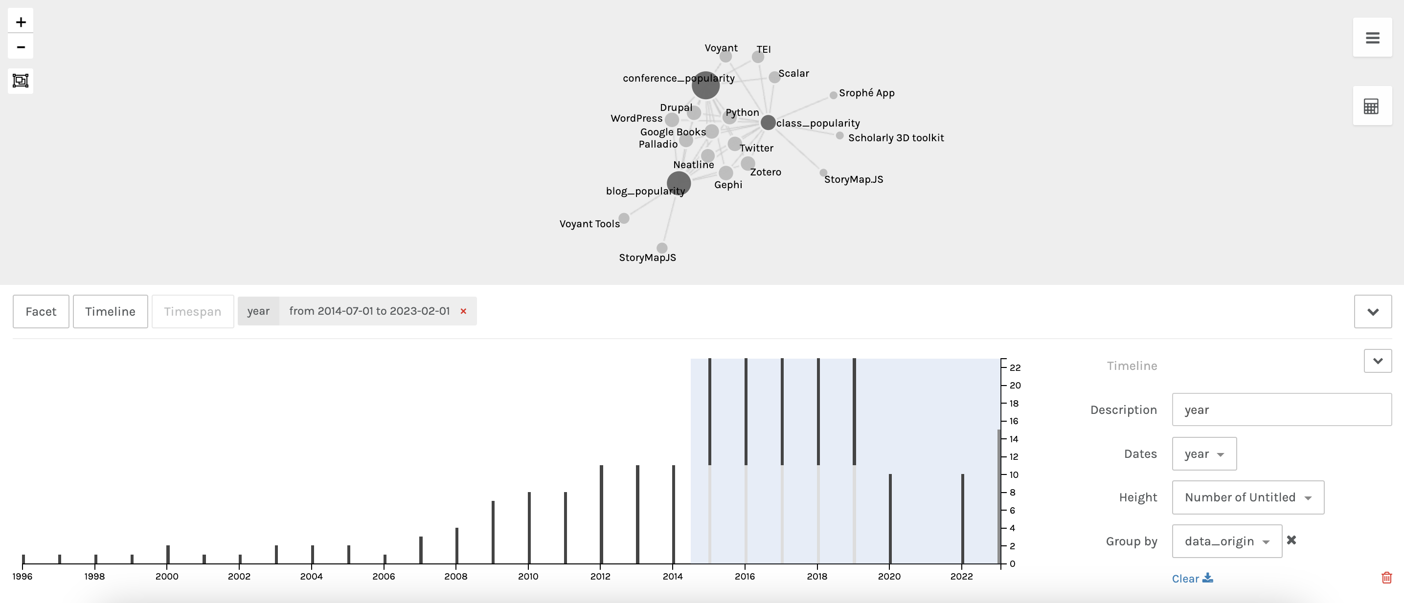
This shows us the subset of data for all three data_origins. We can also start to explore the metrics between these datasets:
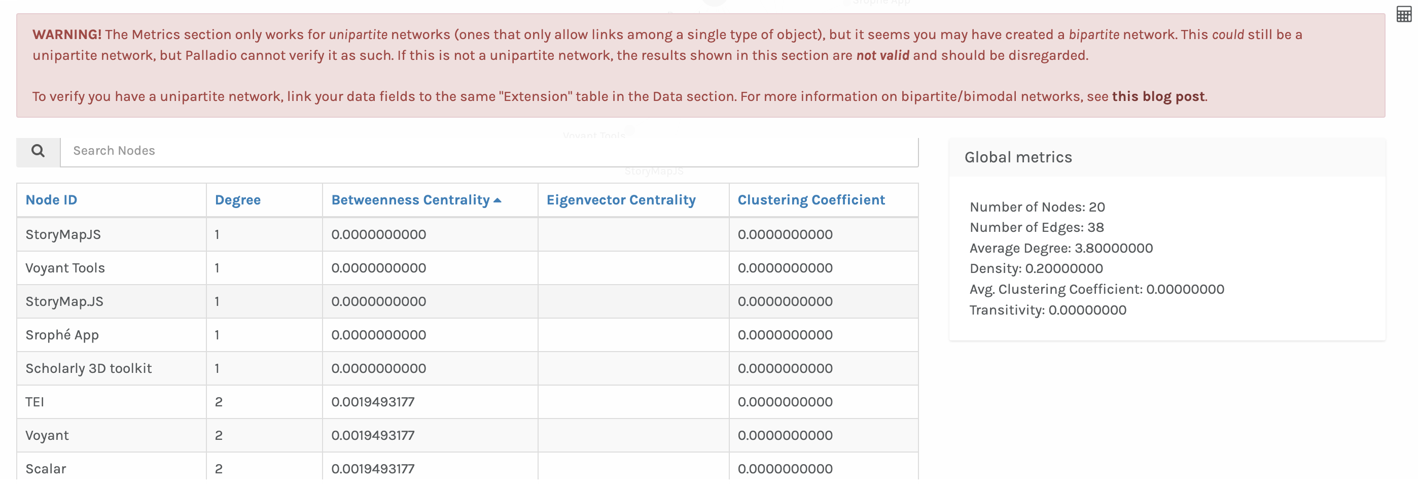
You’ll notice we are getting an error about trying to run metrics on a bipartite network rather than a unipartite network. These types of networks were discussed in last week’s readings. In most network analysis tools, they assume you want to work with unipartite rather than bipartite data. So we need to figure out how to convert our data to unipartite data.
In this case we might want to collapse data_origin as an edge between tool_name.
So instead of the following data structure:
| tool_name | tool_counts | data_origin | year |
|---|---|---|---|
| Drupal | 1.0 | class_popularity | 2023 |
| Drupal | 100.0 | conference_popularity | 2000 |
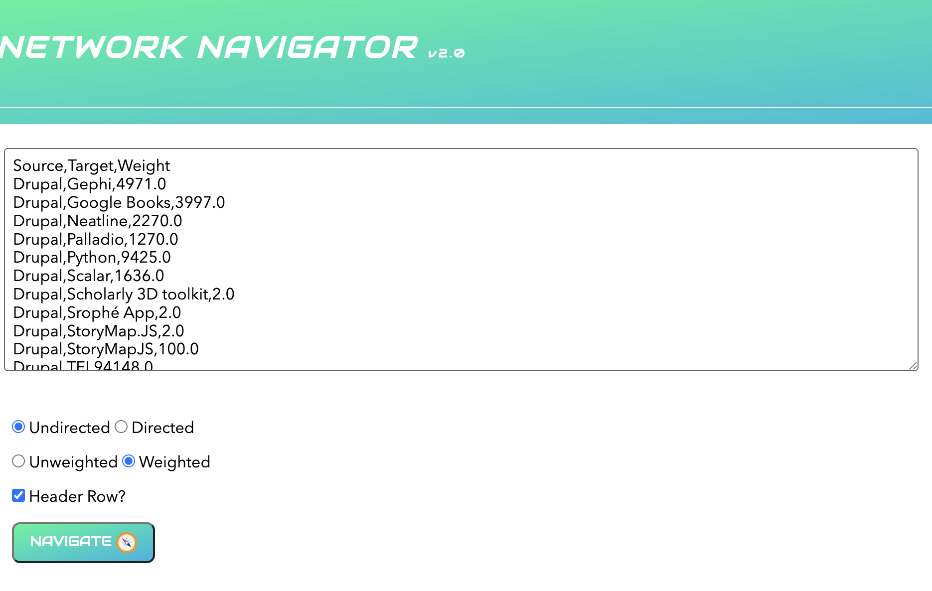
We want to create the following data structure:
| source | target | weight |
|---|---|---|
| Drupal | Drupal | 1.0 |
Projecting is difficult to do in Google Sheets or Excel, so often this is where people either manually annotate their data or using programming.
For the sake of time, I’m using programming but I’m happy to show how to do this manually. You can find the code in the following Colab notebook if you are curious.
Once we’ve created our new data structure, we can upload it to Palladio and see the following:
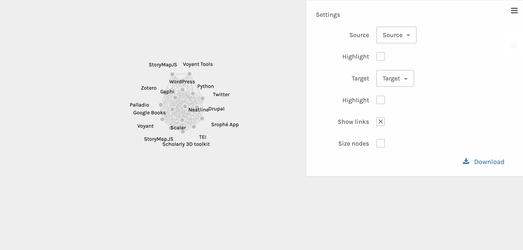
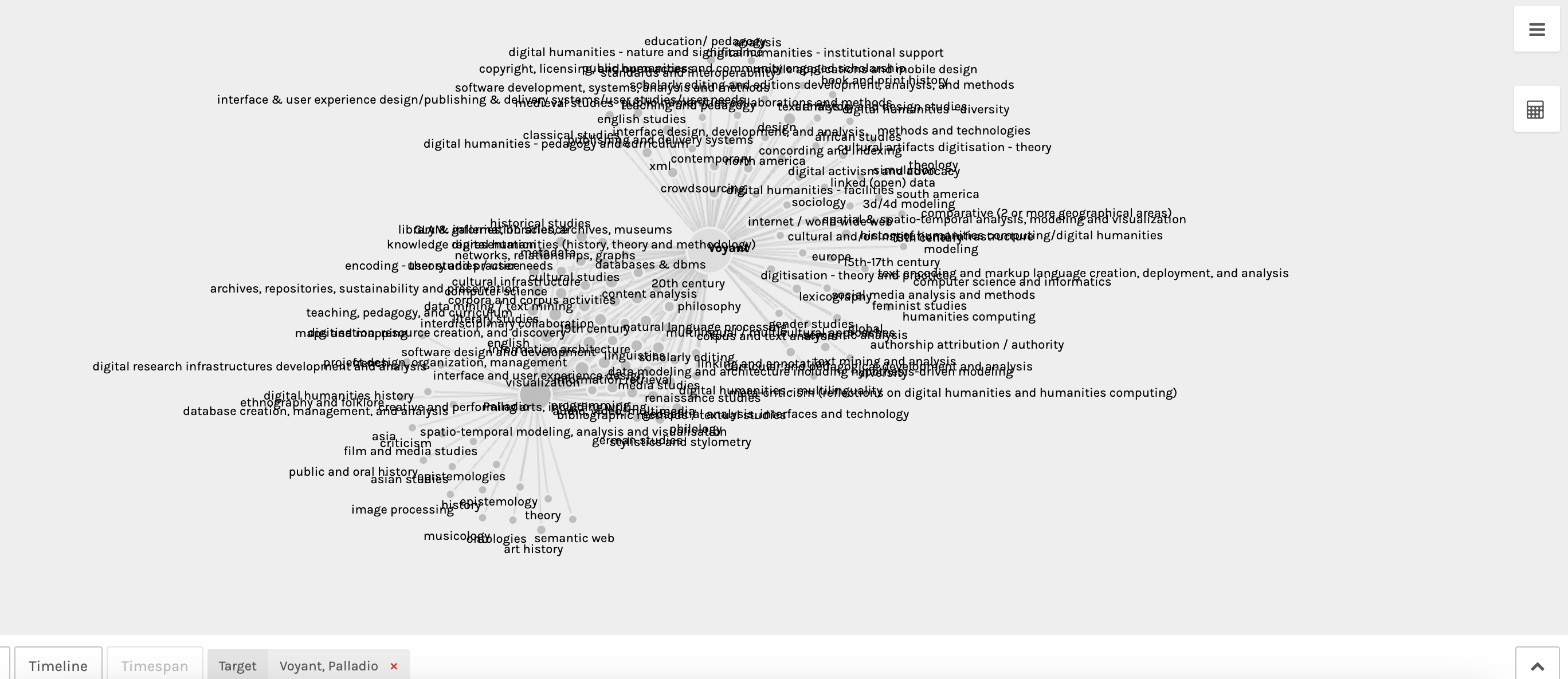
This now accurately shows our data but isn’t that meaningful. We might try faceting to one tool like Voyant:
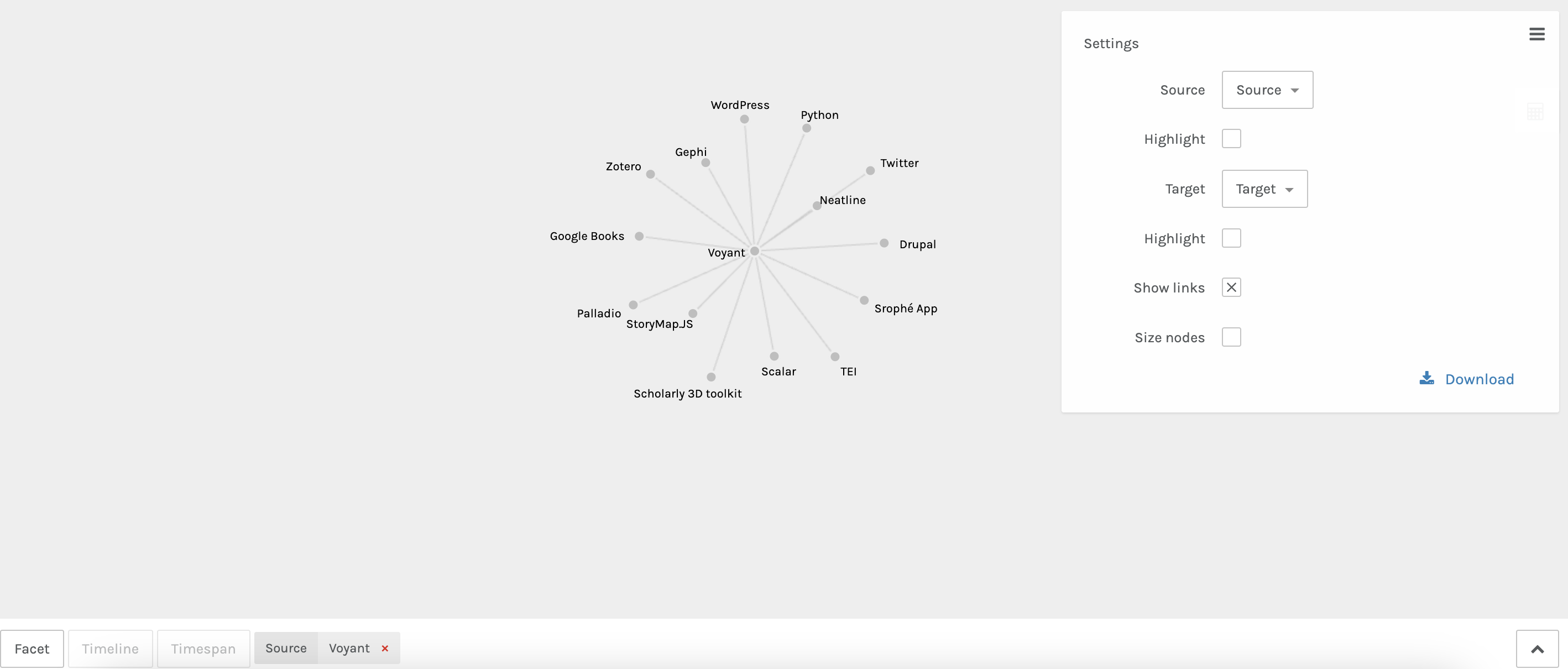
But again this just shows us our connections. So instead, we might try a different tool like Network Navigator.
Now if we upload our data to Network Navigator we need to be careful to change the column names to source and target:
Now we can see a similar force layout graph, but if we select adjacency matrix we can see the following:
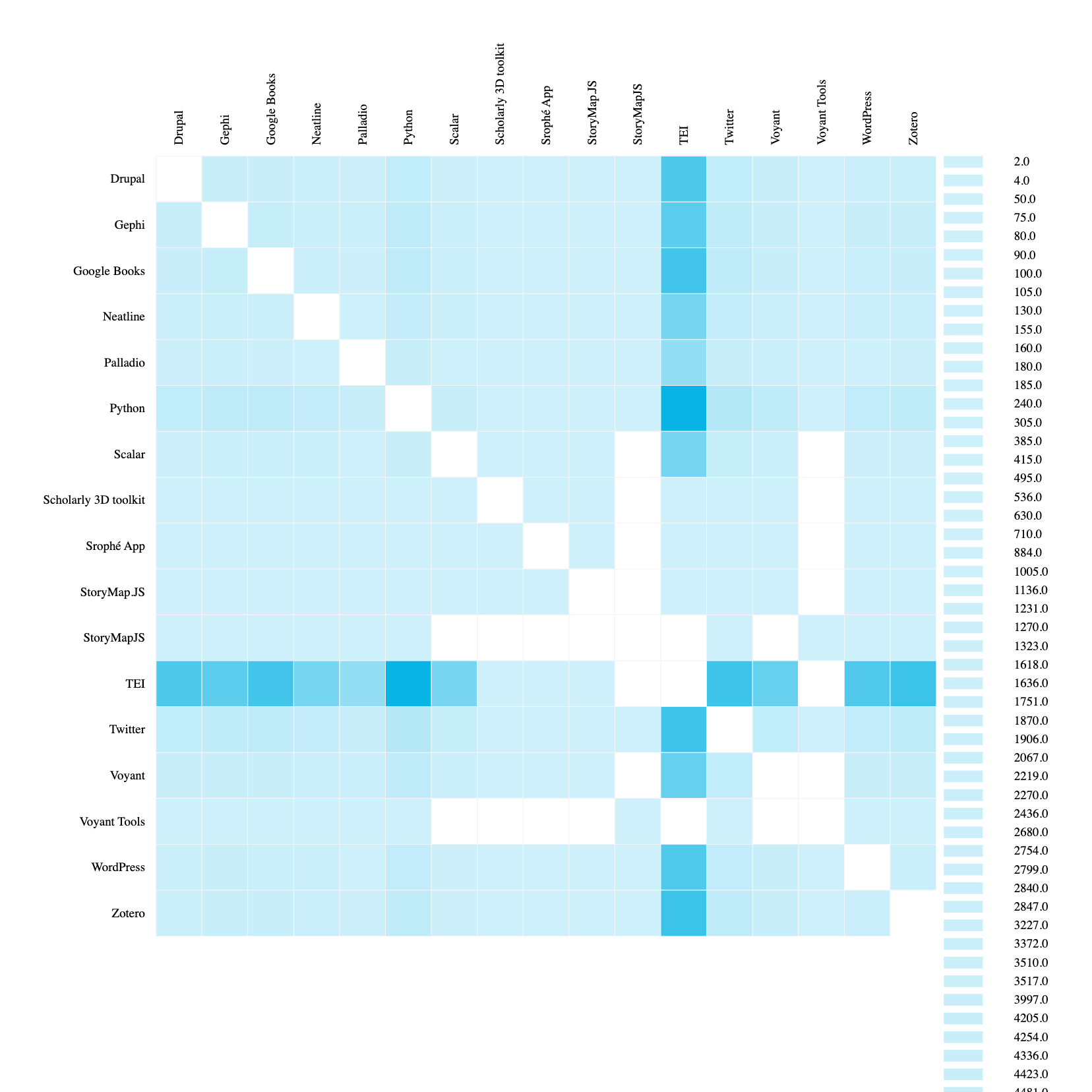
This is starting to help us see the overlap between tools in our dataset. We can even rerun our code to filter out TEI since it is so overwhelming and regenerate this graph:
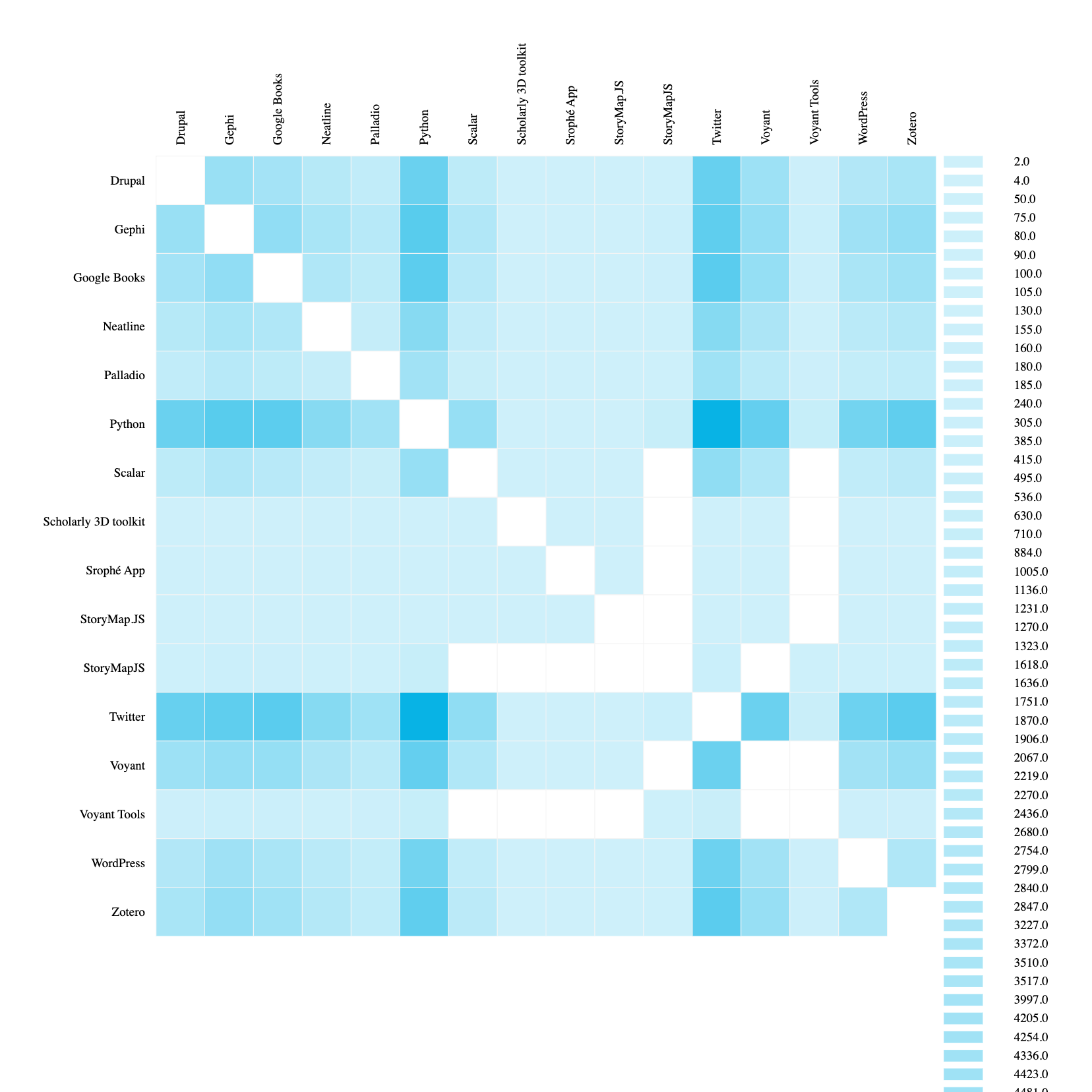
Now we can for example see that Twitter and Python are likely to overlap at conferences, whereas Palladio is less likely to overlap with those two tools.
These examples are a bit contrived, but hopefully they give you a sense of how you might start to explore your own data.
A less contrived question might be how do we explore the relationship between tools and conferences, or even keywords and topics to conferences or tools.
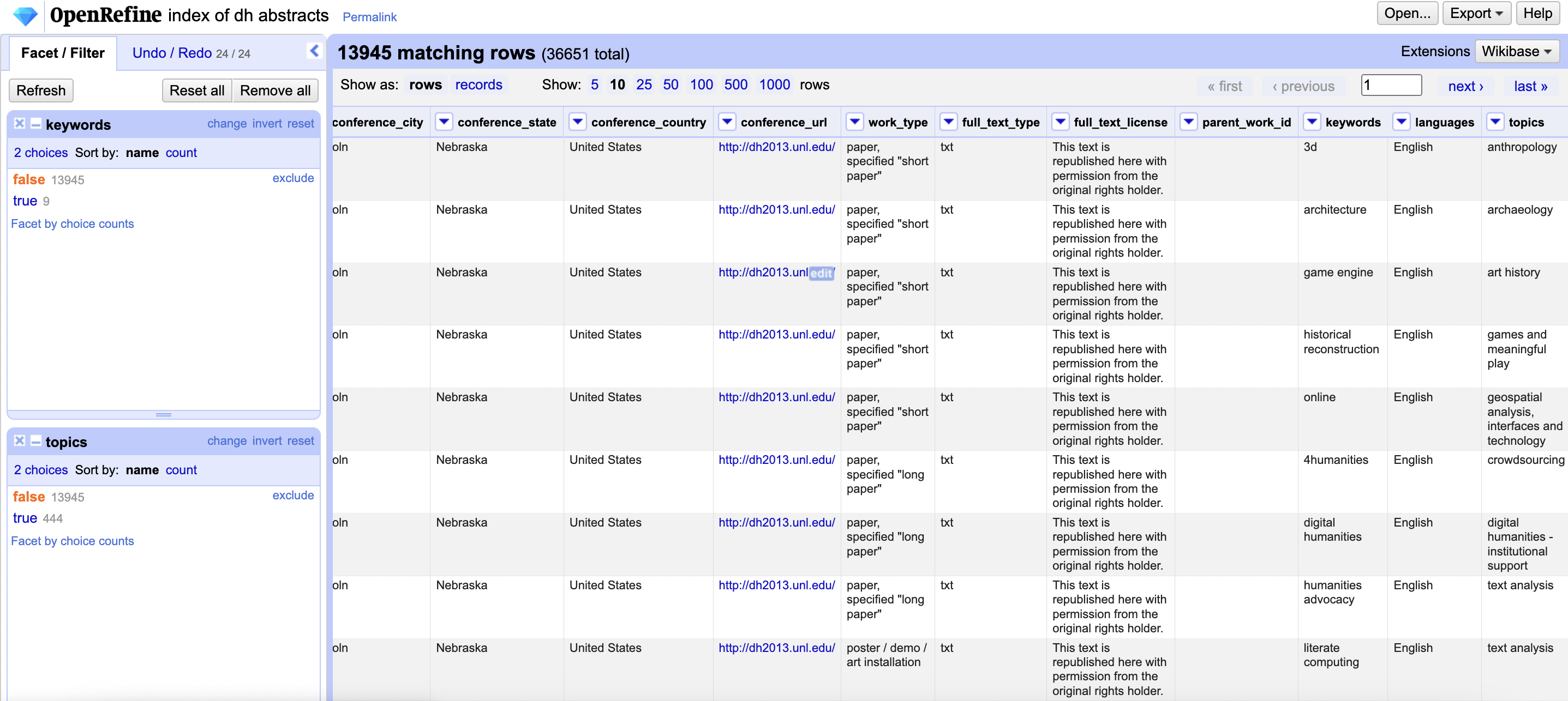
Now we can split our keywords and topics using OpenRefine and then merge our datasets together:
But for time, I’m once again going to use some code to generate our data (you can find it in the same notebook if you are curious). The result is the following datasets:
bipartite_weighted_keyword_tool_edges.csv, which as the following structure:
| Date | Location | Source | Target | Weight |
|---|---|---|---|---|
| 1996-01-01 | Bergen, Norway | TEI | Japanese classical text | 2 |
| 1996-01-01 | Bergen, Norway | TEI | archaeology | 1 |
bipartite_weighted_topic_tool_edges.csv, which as the following structure:
| Date | Location | Source | Target | Weight |
|---|---|---|---|---|
| 2013-01-01 | Lincoln, Nebraska, United States | GLAM: galleries, libraries, archives, museums | Drupal | 2 |
| 2013-01-01 | Lincoln, Nebraska, United States | GLAM: galleries, libraries, archives, museums | Google Books | 1 |
Now if we upload the topic network to Palladio we see the following:
This is pretty overwhelming so we might also try faceting by tools, like Palladio and Voyant, which starts to show us which topics overlap between these tools:
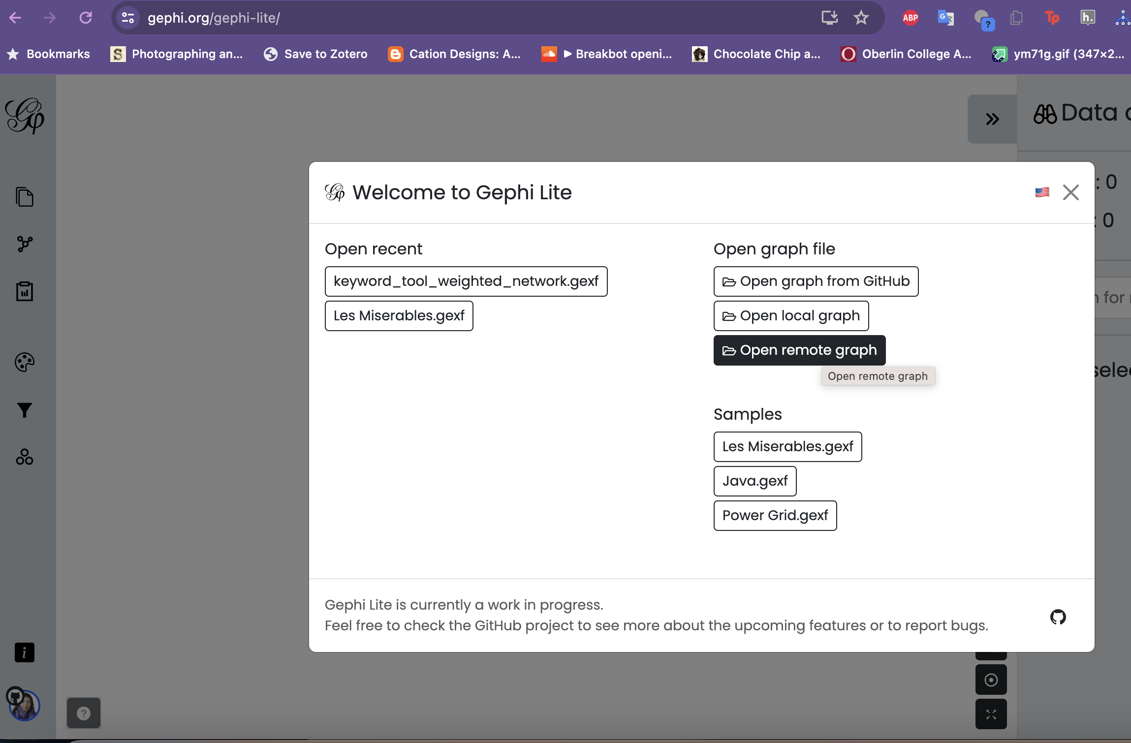
Now if we try to do the same with our keywords you may find that the browser crashes because it is so much data (over 3000 rows). One alternative is to try something like Gephi-lite.
Now normal Gephi would let us just upload our spreadsheet but Gephi-lite requires an gexf file. I’m generating these in this code notebook, but you could also download Gephi and generate them locally from the spreadsheets that way.
I’ve also uploaded the gexf files to GitHub so now we can use them from GitHub directly in Gephi-Lite:
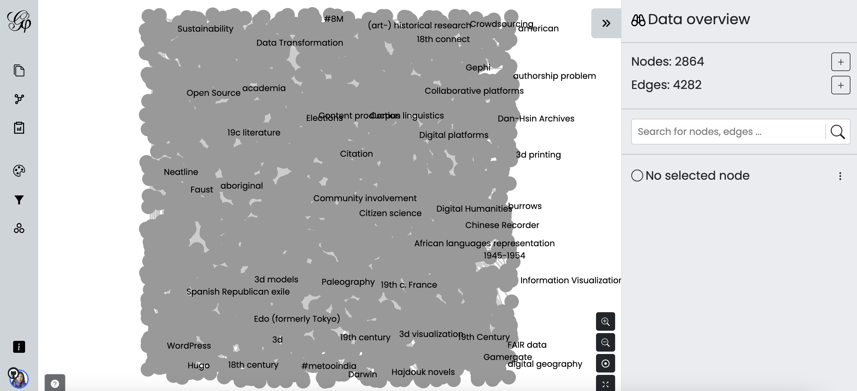
This gives us an initial graph:
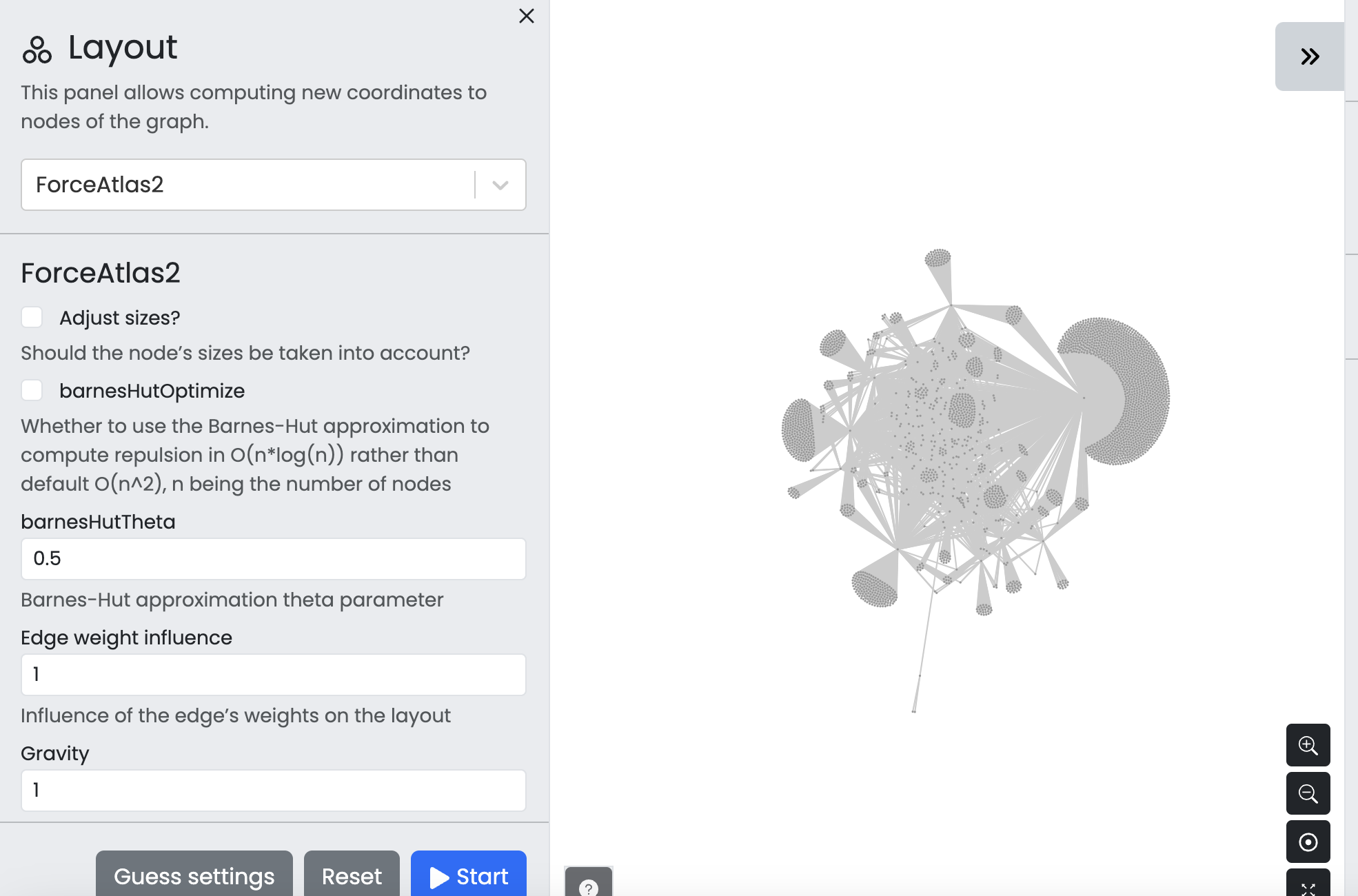
That we can then use layout algorithms like force layout to visulize our network:
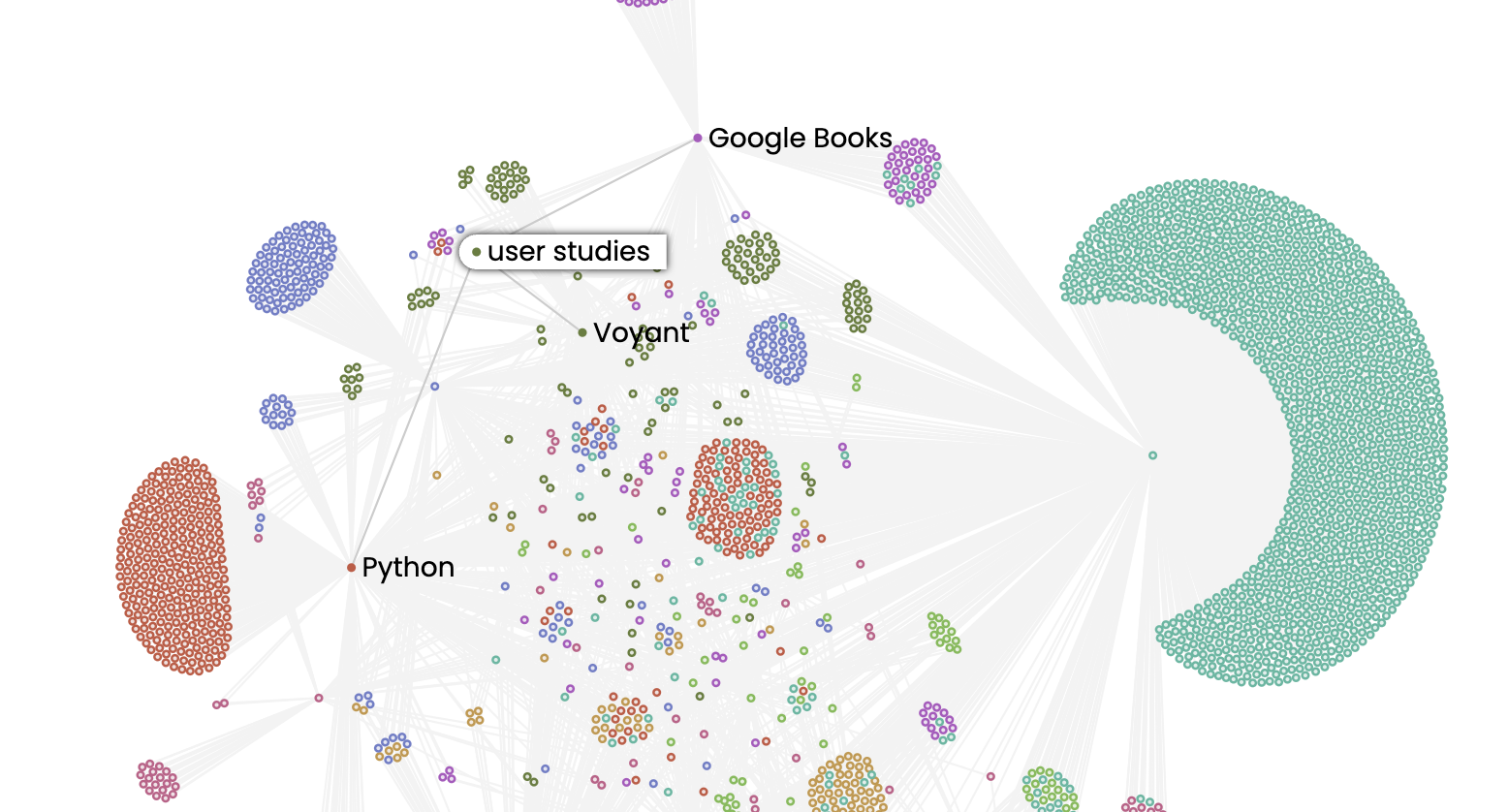
And then we can use statistics to color our network again:
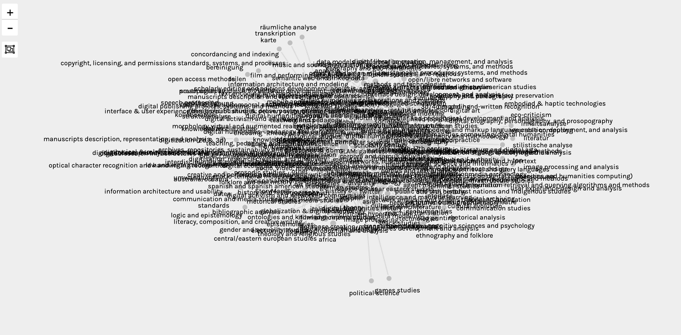
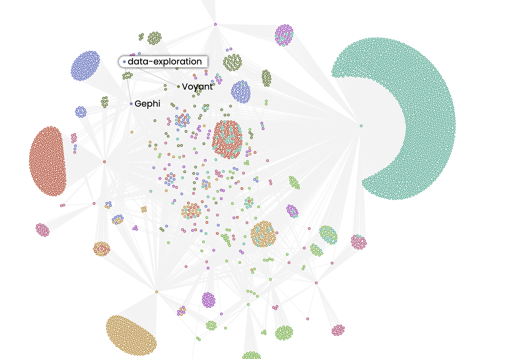
The result is a graph that shows us that certain keywords like user_studies connects certain tools:
Compared to data_exploration:
And we can even search for nodes like mapping, which is shared across multiple tools:
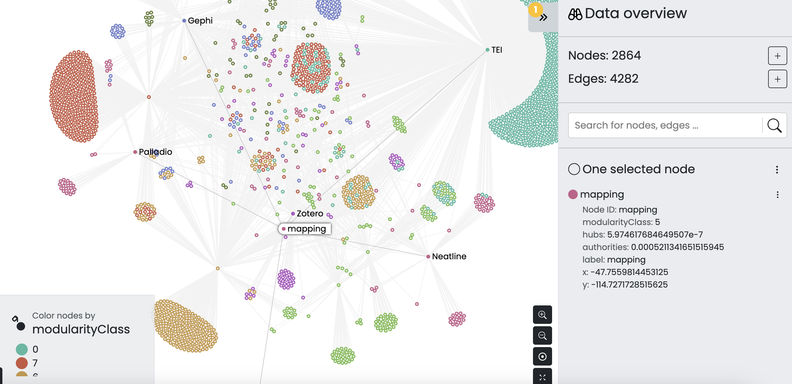
There’s more explorations we could do, and we could still even project this graph for example but hopefully you are starting to see the potential for network analysis.
Mapping in DH
Now that we have discussed some of the mapping projects from this week, as well as the broader question of why and how we map in Digital Humanities, we can start to explore ways to map our own data.
You’ll notice that I’ve included a location column in some of these networked datasets. Let’s try using the projected_weighted_tools_dates_location_edges.csv.
We can start by uploading our data to Palladio and seeing what we can do:
You’ll notice that our map contains no data. That’s because our location column though containing the locations of columns is not actually geocoded.
Geocoding Location Data
Often in DH, scholars want to create maps from data but struggle to understand that places mentioned in texts or spreadsheets aren’t necessarily geographic locations.
To transform that type of data, we need to do something called geocoding.
Geocoding is the process of converting addresses (like “1600 Amphitheatre Parkway, Mountain View, CA”) into geographic coordinates (like latitude 37.423021 and longitude -122.083739), which you can use to place markers on a map, or position the map.
Here’s a step-by-step breakdown of how geocoding typically works:
-
Input Data: The process begins with an address or place name, which can come from various sources such as a spreadsheet, database, or text.
-
Query: This input data is then sent as a query to a geocoding service.
-
Processing: The geocoding service processes this query by searching for a match in its vast database of addresses and geographic coordinates.
-
Output: Once a match is found, the service returns the precise latitude and longitude of the address or place name.
There are a number of different geocoding services, but we can easily use one through Google Sheets with their extension functionality. Today I’m using the Geocoding by Awesome Table extension.

To try this out, I’ve uploaded our dataset to Google sheets and have installed this extension. The first thing though that I’ll try doing is creating a unique list of place names so that I don’t have to geocode the same place multiple times.
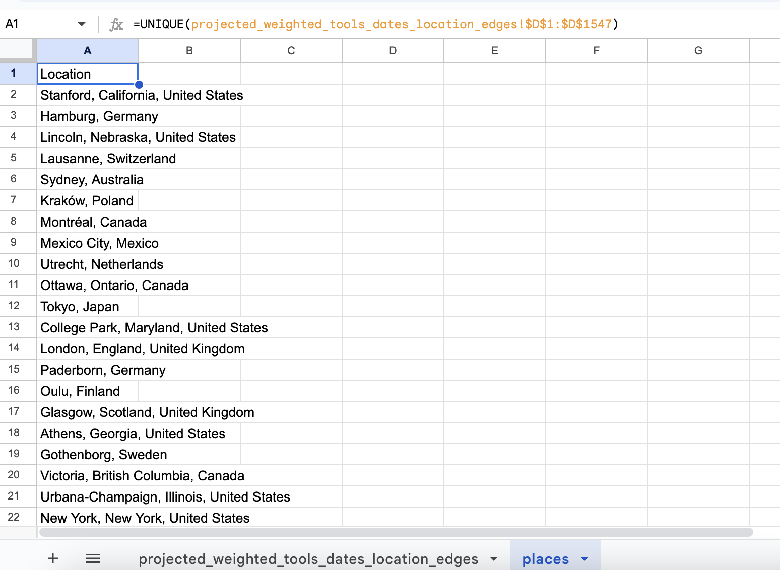
Now I can select the Geocode option from the Add-ons menu:
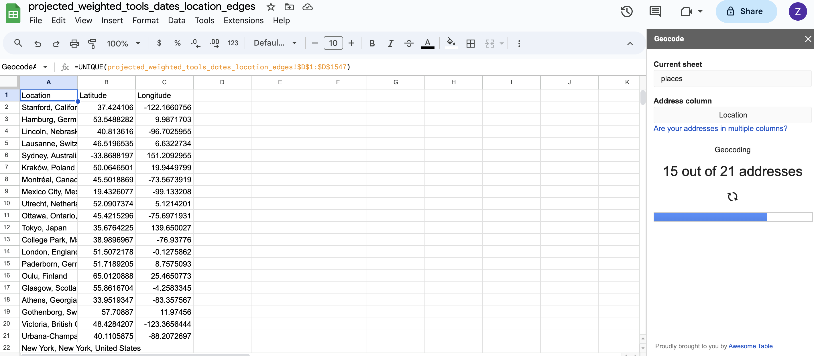
Eyeballing the results, they look fairly accurate but geo-coding as we saw in one of our readings is far from exact science and can often result in empty or incorrect values.
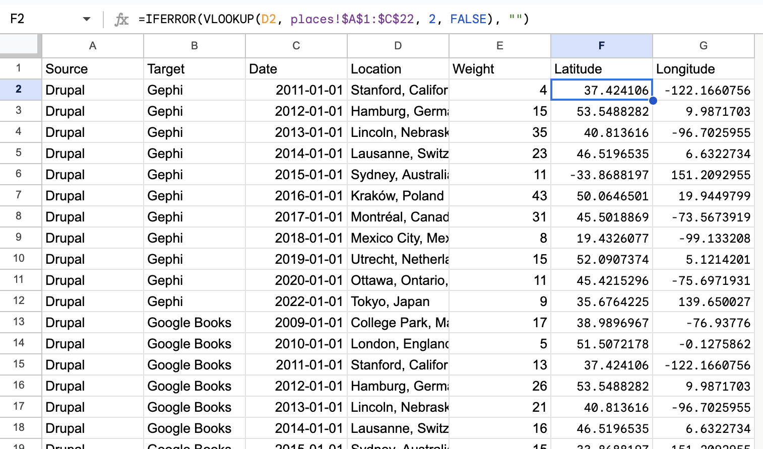
If I’m happy with the results, then I just need to merge the two datasets back together:
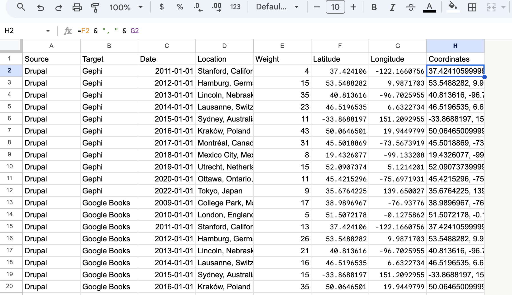
Now I could download my data at this point, but Palladio requires geographic data as coordinates, so next I’ll combine those two columns into a new one:
Now when working with Palladio, I can create the following map:
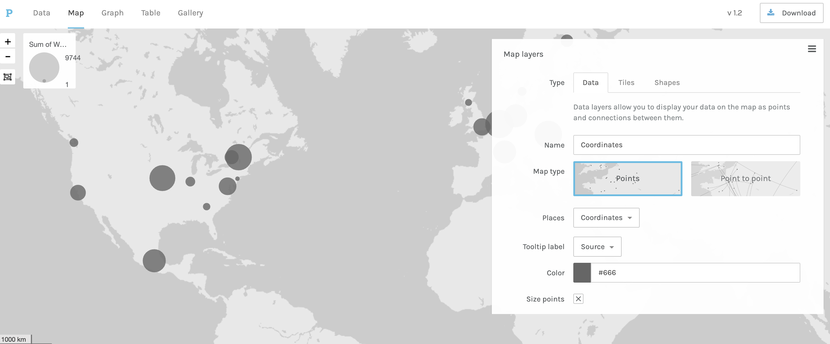
This looks great (though perhaps counting tools to conferences is a bit complicated) but the one downside with Palladio is that I can’t easily create an interactive map.
So, I might try a tool like Kepler.gl, which is a free open-source geospatial analysis tool for large-scale data sets. The tool is produced by Uber, so it is designed to work with large datasets.
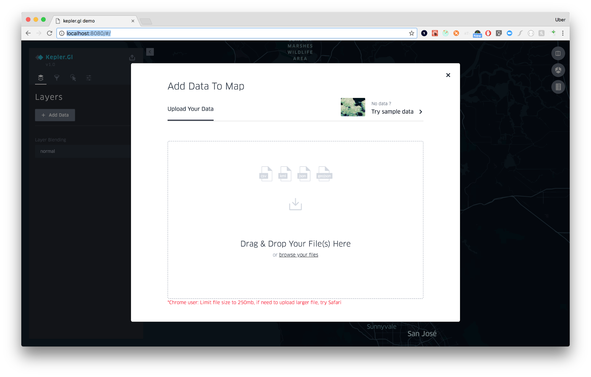
Similar to Palladio we can just upload our data:
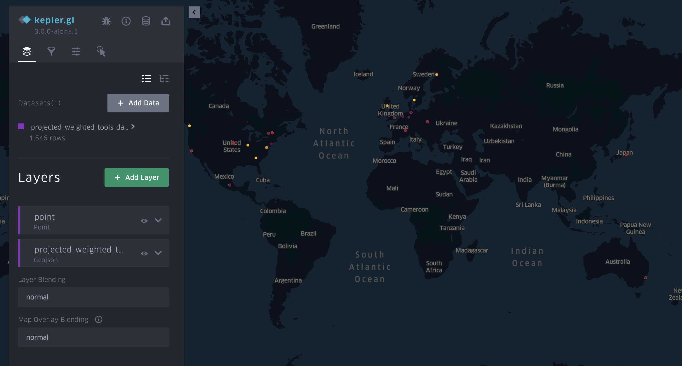
And we should get a map that looks like the following:
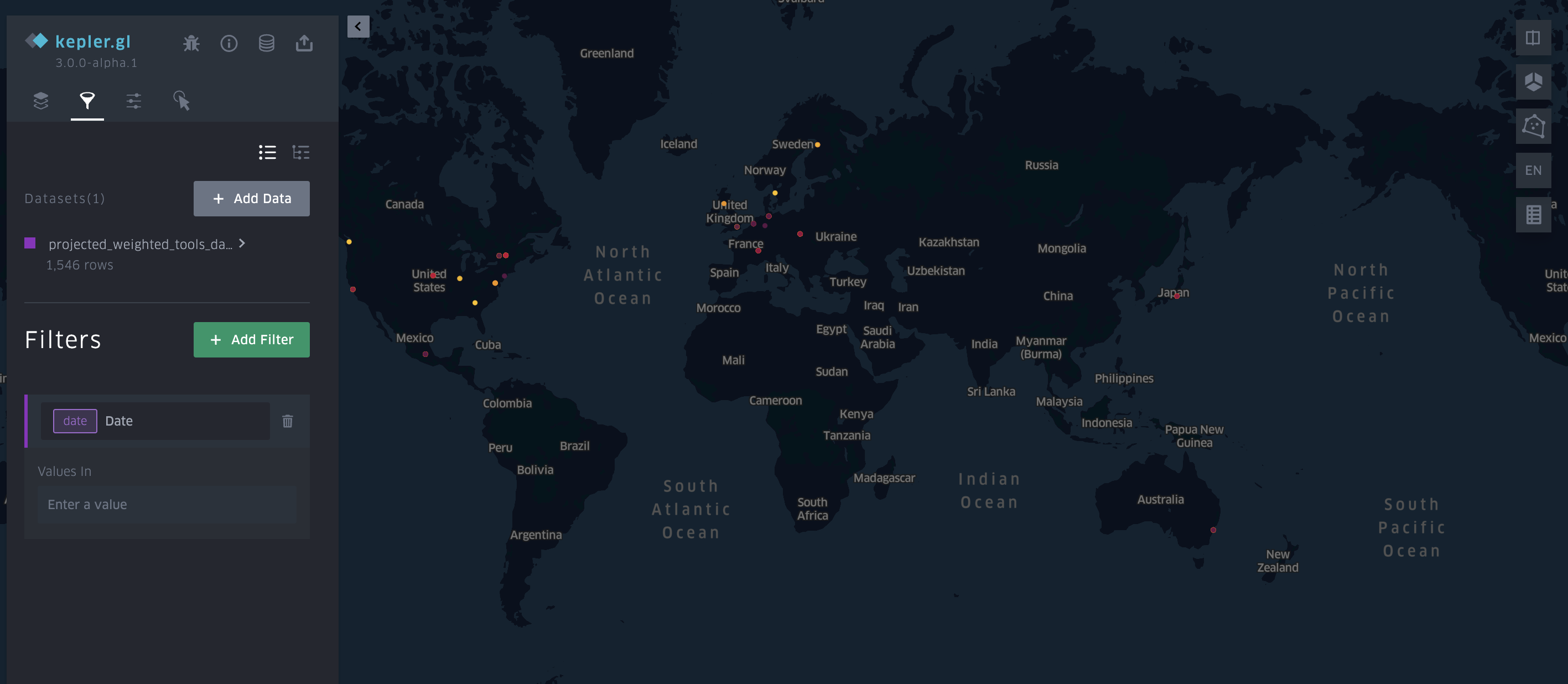
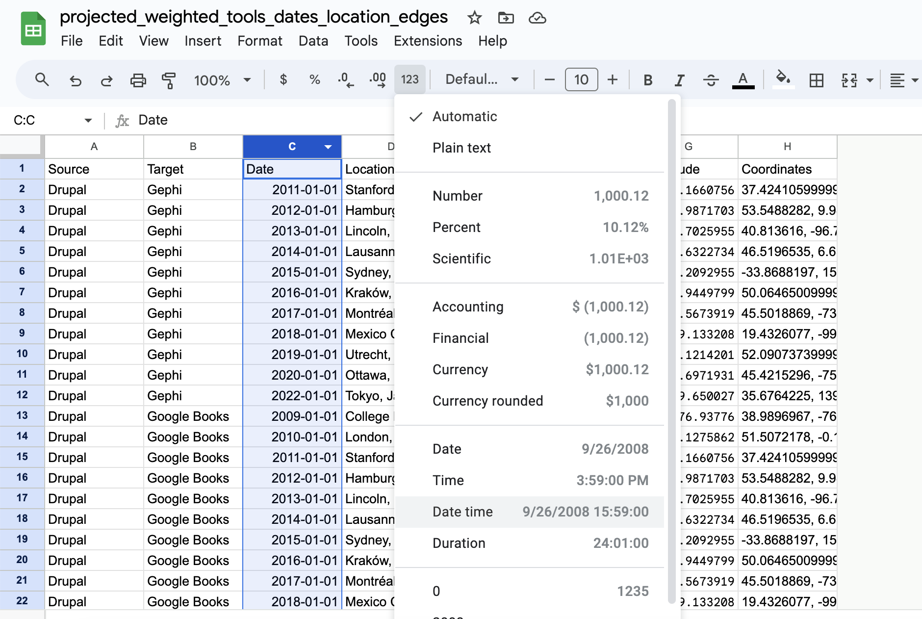
We can start to tweak, but if you go the filter functionality you’ll notice that we aren’t seeing the option of creating a timeline even though Kepler is telling us we have date column:
The issue is that Kepler expects a datetime column, so back in google sheets we can update our dataset to do the following:
And now if we re-upload our data to Kepler we should see the following:
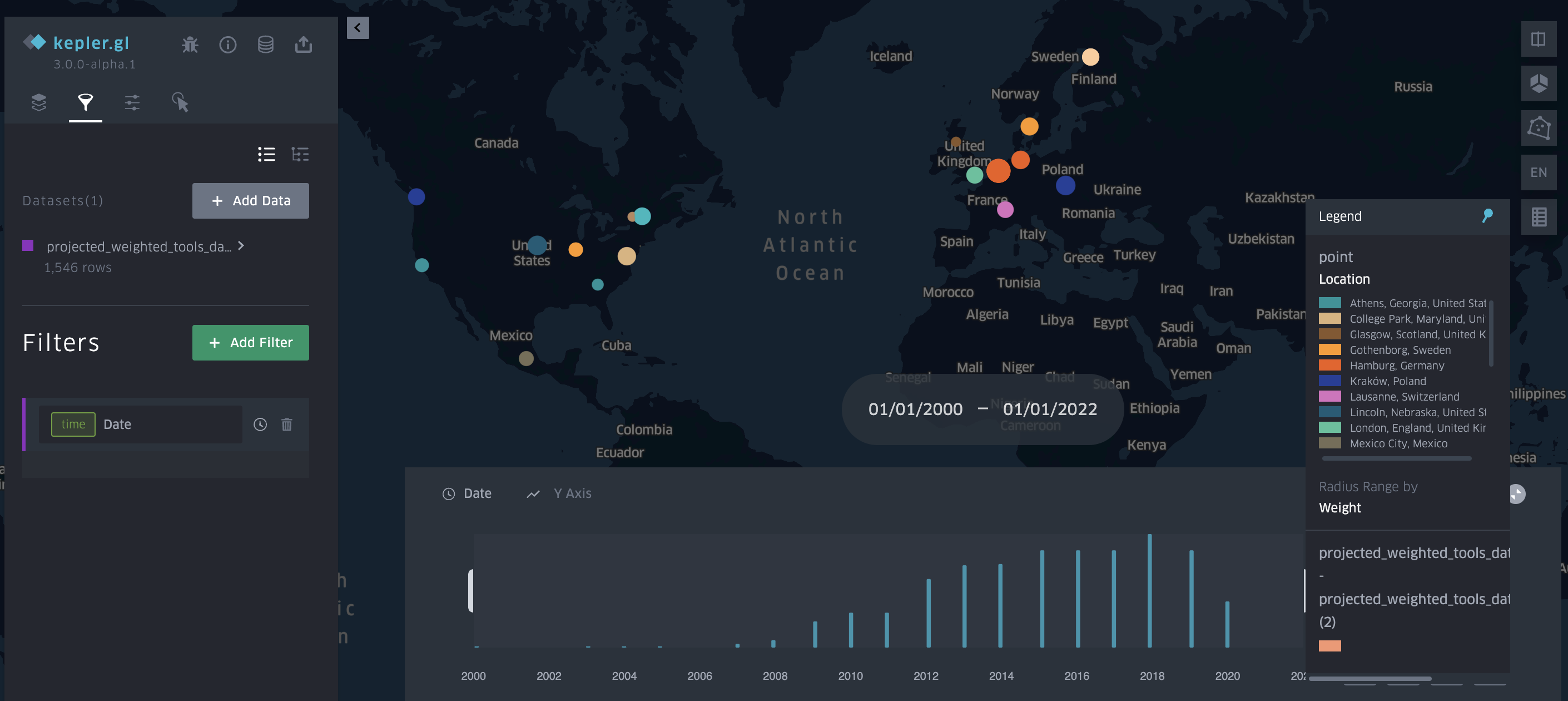
Which we can also embed here:
I’ll explain more of how I embedded this map next week when we starting talking about websites, but you can see how with filtering and the timeline we can start to explore our data. The big question though that we have yet to discuss is how accurate my geocoding is and how I might improve it.
Mapping Assignment(s)
For your assignment this week, you have two options:
- Compare and Compass: Testing Mapping Tools
For this assignment, you are welcome to use any data (including our dataset from class available here https://github.com/ZoeLeBlanc/is578-intro-dh/blob/gh-pages/public_course_data/network_data/geocoded_projected_weighted_tools_dates_location_edges.csv, or data from any of the projects we looked at or some other dataset). The goal is to try out different mapping tools and either compare between them OR generate multiple different style maps in one tool. Depending on the tools you try, mapping might be more laborious, so it is acceptable if your map is more of a prototype or proof of concept, and therefore has fewer data points.
Some potential mapping tools include the ones we discussed in class:
- Kepler.gl https://kepler.gl/
- Palladio https://hdlab.stanford.edu/palladio/
- StoryMaps.JS https://storymap.knightlab.com/
- ArcGIS StoryMaps https://storymaps.arcgis.com/
- Flourish Maps https://flourish.studio/
- Tableau Maps https://www.tableau.com/
- Google Maps https://www.google.com/maps
- Geojson.io https://geojson.io/
- Mapbox https://www.mapbox.com/
But you are welcome to use any other mapping tool you find. The goal is to consider the following questions:
- What is the process of uploading data to the tool or creating a map? Is it easy or difficult?
- What sort of visualization options does the tool have? Are you able to visualize the data how you imagined? Are there any limitations?
- What sort of interactivity does the tool have? Is it easy to filter or explore the data?
- Can you export the map? If so, what formats are available? Can you embed the map in a website?
Once completed, you should upload a screenshot of your map (or whatever format makes the most sense) and share your dataset in this GitHub discussion forum https://github.com/ZoeLeBlanc/is578-intro-dh/discussions/8.
- Place to Space: Try out Geocoding and Mapping
So far we have been using place names already provided to us, but from our readings we also know that we can also extract place names from text to geocode and map them.
We’ve seen an example this before in Voyant Tools:
For this assignment, you can use any textual data (whether your own or abstracts from the Index of DH Conferences or novels, etc.), and the goal is to and try create a dataset of place names to map. You can use any spreadsheet software and any geocoding service, as well as any mapping tool. But the goal is to have at least 10 locations and a map to share with the class.
Some things to consider include:
- What would you define as a place name? Is that the same as a geographic location?
- Could you use something like Google Sheets to automate the process of geocoding? Or even the process of locating place names?
- Are your locations points or larger polygons? How might you represent that in your map?
- Are you interested in story mapping or more aggregate views?
Once completed, you should upload a screenshot of your map (or whatever format makes the most sense) and share your dataset in this GitHub discussion forum https://github.com/ZoeLeBlanc/is578-intro-dh/discussions/8.
Resources
- Miriam Posner’s Mapping Resources https://miriamposner.com/classes/dh201w23/tutorials-guides/mapping/mapping-resources/ and recommended mapping tools https://miriamposner.com/classes/dh101f17/tutorials-guides/mapping/recommended-mapping-tools/
- Stephen Robertson’s Teaching Digital Mapping with kepler.gl https://drstephenrobertson.com/blog-post/teaching-digital-mapping-with-kepler-gl/