Snow Days and Twitter Reporting
This post is one I wrote for VIDL in the middle of the first bizarre snowstorm that gripped Tennessee in February. Until moving to Nashville, I spent 23 years living through harsh Canadian winters (any Canadian who knows I’m from Toronto is rolling their eyes at this point), and so I was use to just slogging through giant snowstorms. Yet this past February and March, Nashville and large parts of Tennessee shut down completely in the face of unprecedented amount of snow and ice (a few inches of each, which is essentially spring in Canada but I digress again). Unsure of what exactly was going on, I turned to twitter for the latest updates. I was amazed with what I found, which was a robust community of citizen journalists sharing weather updates and measurements. So I did what anyone would when snowed in, I decided to try out some network graphing analysis.
Though today is a snow day at Vanderbilt Campus, we at VIDL never let a little bit of weather stop us. In honor of today’s storm, this post is a look at how Tennesseans are using Twitter to report on the storm. One of my favorite topics is the role of citizens in the new digital age and so with all the tweets and pics of the bad weather, I wanted to see how these networks are operating.
Using the twitter tag #tspotter, I used Martin Hawksey’s TAGS API to analyze the network data. TAGS is much easier to use than Gephi or other network analysis tools, and is free, which is rare. All you have to do is copy TAGS as a google doc and authorize your twitter account. After that you run the script, which aggregates all the 3000 latest tweets from the last week. #tspotter had about 1200 unique tweets, and I used Hawksey’s TAGSExplorer to visualize the network. Read the rest here…
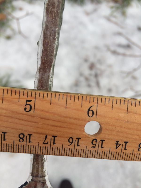 Picture of Ice on Vanderbilt Campus by @ewillmot
Using the twitter tag #tspotter, I used Martin Hawksey’s TAGS API to analyze the network data. TAGS is much easier to use than Gephi or other network analysis tools, and is free, which is rare. All you have to do is copy TAGS as a google doc and authorize your twitter account. After that you run the script, which aggregates all the 3000 latest tweets from the last week. #tspotter had about 1200 unique tweets, and I used Hawksey’s TAGSExplorer to visualize the network.
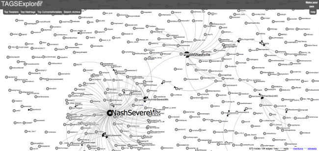 Network of replies from #tspotter
This first graph is of the replies from #tspotter, and shows a very loose network with the exception of @NashSeverWX and @NWSNashville. You can inspect the dynamic network here.
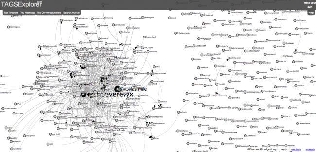 Network of replies and mentions of #tspotter
This second graph of replies and mentions of #tspotter is starting to show a more dense network, though still with a lot of outliers. You can explore the dynamic network here.
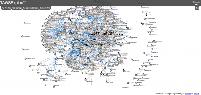 Network of replies, mentions, and retweets of #tspotter
This final graph of the replies, mentions, and retweets of #tspotter is as you would expect much more dense. However, I was really blown away with how much this graph seems to represent a community of Tennesseans taking to twitter to show their experiences of this rare metereological event. The fact that the top tweeter is @NashSevereWX, which relies on social media to report on weather, I think speaks to the growth of social media as a tool for citizen participation. You can check out the final graph here and feel free to post your pics below or tweet us @VUdigital.
Stay warm Tennessee!
Enjoy Reading This Article?
Here are some more articles you might like to read next: